Related Research Articles

Typography is the art and technique of arranging type to make written language legible, readable and appealing when displayed. The arrangement of type involves selecting typefaces, point sizes, line lengths, line-spacing (leading), and letter-spacing (tracking), and adjusting the space between pairs of letters (kerning). The term typography is also applied to the style, arrangement, and appearance of the letters, numbers, and symbols created by the process. Type design is a closely related craft, sometimes considered part of typography; most typographers do not design typefaces, and some type designers do not consider themselves typographers. Typography also may be used as an ornamental and decorative device, unrelated to the communication of information.

In typography and lettering, a sans-serif, sans serif, gothic, or simply sans letterform is one that does not have extending features called "serifs" at the end of strokes. Sans-serif fonts tend to have less stroke width variation than serif fonts. They are often used to convey simplicity and modernity or minimalism.

Jan Tschichold was a calligrapher, typographer and book designer. He played a significant role in the development of graphic design in the 20th century – first, by developing and promoting principles of typographic modernism, and subsequently idealizing conservative typographic structures. His direction of the visual identity of Penguin Books in the decade following World War II served as a model for the burgeoning design practice of planning corporate identity programs. He also designed the much-admired typeface Sabon.

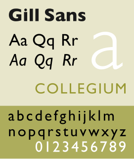
Gill Sans is a humanist sans-serif typeface designed by Eric Gill and released by the British branch of Monotype from 1928 onwards.

Paul Friedrich August Renner was a German typeface designer. In 1927, he designed the Futura typeface, which became one of the most successful and most-used types of the 20th century. He was born in Wernigerode, and died in Hödingen.

Monotype Imaging Holdings Inc. is an American company that specializes in digital typesetting and typeface design for use with consumer electronics devices. Incorporated in Delaware and headquartered in Woburn, Massachusetts, the company has been responsible for many developments in printing technology—in particular the Monotype machine, which was a fully mechanical hotmetal typesetter, that produced texts automatically, all single type. Monotype was involved in the design and production of many typefaces in the 20th century. Monotype developed many of the most widely used typeface designs, including Times New Roman, Gill Sans, Arial, Bembo and Albertus.

Stanley Morison was an influential British typographer, printing executive and historian of printing. Largely self-educated, he promoted higher standards in printing and an awareness of the best printing and typefaces of the past.

Royal Joh. Enschedé is a printer of security documents, stamps and banknotes based in Haarlem, Netherlands. Joh. Enschedé specialises in print, media and security. The company hosted the Museum Enschedé until 1990 and has branches in Amsterdam, Brussels and Haarlem.
Word spacing in typography is space between words, as contrasted with letter-spacing and sentence spacing. Typographers may modify the spacing of letters or words in a body of type to aid readability and copy fit, or for aesthetic effect. In web browsers and standardized digital typography, word spacing is controlled by the CSS1 word-spacing property.

Goudy Old Style is an old-style serif typeface originally created by Frederic W. Goudy for American Type Founders (ATF) in 1915.

Modern typographers view typography as a craft with a very long history tracing its origins back to the first punches and dies used to make seals and coinage currency in ancient times. The basic elements of typography are at least as old as civilization and the earliest writing systems—a series of key developments that were eventually drawn together into one, systematic craft. While woodblock printing and movable type had precedents in East Asia, typography in the Western world developed after the invention of the printing press by Johannes Gutenberg in the mid-15th century. The initial spread of printing throughout Germany and Italy led to the enduring legacy and continued use of blackletter, Roman and italic types.
Emil Ruder (1914–1970) was a Swiss typographer and graphic designer, who with Armin Hofmann joined the faculty of the Schule für Gestaltung Basel.

Sabon is an old-style serif typeface designed by the German-born typographer and designer Jan Tschichold (1902–1974) in the period 1964–1967. It was released jointly by the Linotype, Monotype, and Stempel type foundries in 1967. The design of the roman is based on types by Claude Garamond, particularly a specimen printed by the Frankfurt printer Konrad Berner. Berner had married the widow of a fellow printer Jacques Sabon, the source of the face's name, who had bought some of Garamond's type after his death. The italics are based on types designed by a contemporary of Garamond's, Robert Granjon. It is effectively a Garamond revival, though a different name was chosen as many other modern typefaces already carry this name.

FF Scala is an old-style serif typeface designed by Dutch typeface designer Martin Majoor in 1991 for the Muziekcentrum Vredenburg in Utrecht, the Netherlands. The FF Scala font family was named for the Teatro alla Scala (1776–78) in Milan, Italy. Like many contemporary Dutch serif faces, FF Scala is not an academic revival of a single historic typeface but shows influences of several historic models. Similarities can be seen with William Addison Dwiggins' 1935 design for the typeface Electra in its clarity of form, and rhythmic, highly calligraphic italics. Eric Gill's 1931 typeface Joanna, with its old style armature but nearly square serifs, is also similar in its nearly mono-weighted stroke width.

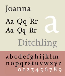
Joanna is a serif typeface designed by Eric Gill (1882–1940) in the period 1930–31, and named for one of his daughters. Gill chose Joanna for setting An Essay on Typography, a book by Gill on his thoughts on typography, typesetting, and page design. He described it as "a book face free from all fancy business."

Bitstream Charter is a serif typeface designed by Matthew Carter in 1987 for Bitstream Inc. Charter is based on Pierre-Simon Fournier’s characters, originating from the 18th century. Classified by Bitstream as a transitional-serif typeface, it also has features of a slab-serif typeface and is often classified as such.

The Bauhaus typeface design is based on Herbert Bayer's 1925 experimental Universal typeface and the Bauhaus aesthetic overall.

Modern typography was a reaction against the perceived decadence of typography and design of the late 19th century. It is mostly associated with the works of Jan Tschichold and Bauhaus typographers Herbert Bayer, László Moholy-Nagy, El Lissitzky and others.
Christopher Burke is a British writer on typography and a typeface designer.

Hans Peter Schmoller was a German and British graphic designer who worked as Head of Typography and Design at Penguin Books from 1949 to 1976. During his Penguin years he played a crucial role in postwar British typography, and has been described as one of the most influential typographers of the last century.
References
- ↑ The seeming contradiction between standardization and diversity is explained by the vast numbers of books produced by Penguin over many years.
- ↑ "Archived copy". Archived from the original on 2013-11-05. Retrieved 2013-05-15.CS1 maint: archived copy as title (link)
- 1 2 3 Richard Doubleday, "Jan Tschichold at Penguin Books: A Resurgance [sic] of Classical Book Design" (PDF).