This article's lead sectionmay be too short to adequately summarize the key points. Please consider expanding the lead to provide an accessible overview of all important aspects of the article.(December 2012)
Apple Inc. uses a large variety of typefaces in its marketing, operating systems, and industrial design with each product cycle. These change throughout the years with Apple's change of style in their products. This is evident in the design and marketing of the company. The current logo is a white apple with a bite out of it, which was first utilized in 2013.
For at least 18 years, Apple's corporate typeface was a custom variant of the ITCGaramond typeface called Apple Garamond. It was used alongside the Apple logo for product names on computers, in many ads and printed materials, and on the company's website. Starting in 2001, Apple gradually shifted towards using Myriad in its marketing. Starting with iPhone 7 in 2016, Apple switched the typeface of the word mark "iPhone" to San Francisco on products and its website.
Hand-drawn logo
Prior to adopting the bitten Apple as its logo, Apple used a complex logo featuring Isaac Newton sitting below an apple tree. The words APPLE COMPUTER CO. were drawn on a ribbon banner ornamenting the picture frame. The frame itself held a quotation from Wordsworth: "Newton....A Mind Forever Voyaging Through Strange Seas of Thought...Alone.", taken from Wordsworth's autobiographical poem The Prelude. The logo was hand drawn and thus did not use an established font. However, the type is similar to Caslon.
Motter Tektura
The Apple logo alongside the Motter Tektura typeface
Before the introduction of the first Macintosh, Apple used a typeface called Motter Tektura for their company logo and product labels,[1] which was originally designed in Austria by Othmar Motter of Vorarlberger Graphik in 1975 and distributed by Letraset (and also famously used by Reebok).[2] At the time, the typeface was considered new and modern. The exact font used by Apple is slightly modified from the standard Motter Tektura: the s is more conventionally shaped, as opposed to the descending "hook" design of the normal typeface, and (with the exception of the Disk II 5.25 drive) the dot over the i is removed.
According to the logo designer, Rob Janoff, the typeface was selected for its playful qualities and techno look, which were in line with Apple's mission statement of making high technology accessible to anyone. Janoff designed the logo in 1977 while working with Palo AltomarketerRegis McKenna.[3] The Apple logo's bite mark was originally designed to fit snugly with the Motter Tektura a.
In the early 1980s, the company logo was simplified by removing "computer ınc.". Motter Tektura is most notably used for the Apple II logo. The typeface has sometimes been mislabeled as Cupertino, a similar bitmap font likely created to mimic Motter Tektura.
Apple Garamond
Apple Garamond was used in most of Apple's marketing.
Since the introduction of the first Macintosh in 1984, Apple adopted a new corporate font called Apple Garamond.[citation needed] It was a variation of the classic Garamond typeface, both narrower and having a taller x-height. Specifically, ITC Garamond (created by Tony Stan in 1977) was condensed to 80% of its normal width. Bitstream condensed the font, subtly adjusted the stroke widths, and performed the hinting required to create the font, which was delivered to Apple as the Postscript font "apgaram".
In cases where the Apple logo was accompanied by text, it was always set in Apple Garamond. Aside from the company name, most of Apple's advertising and marketing slogans, such as "Think different", used the font as well.
The typeface was virtually synonymous with Apple for almost two decades and formed a large part of the company's brand recognition. It was used not only in conjunction with the logo, but also in manuals and ads and to label products with model names.
Apple has not released the true Apple Garamond font. ITC briefly sold ITC Garamond Narrow—Apple Garamond without the custom hinting—as part of its Apple Font Pack in the 1990s. A version of the font was also included under a different name in some versions of Mac OS X prior to 10.3 as it was used by the Setup Assistant installation program.
Gill Sans
In the marketing of the Newton/Notepad/MessagePad PDA (starting in 1992), Apple used Gill Sans instead of the regular Apple Garamond. Gill Sans Regular was used in the logo, for the model name on the computer, on the keyboard and in advertising materials, though it was not used as a screen font (except as part of the Newton logo itself).
Myriad
Adobe's Myriad was used in Apple's marketing 2003–2017.
In 2003, Apple gradually started using a variant of the Adobe Myriad font family in its marketing and packaging. As new revisions of its products were released, the text changed from the serif Apple Garamond to the sans-serif Myriad Apple. The family's bolds were used for headlines, and other weights accordingly.
The Myriad font family was designed by Robert Slimbach and Carol Twombly for Adobe. Adobe's most recent version of Myriad is Myriad Pro, which has some additional enhancements and character set extensions, but is not significantly changed in design. Myriad Apple, a modification produced by Galápagos Design Group, incorporates minor spacing and weight differences from the standard varieties, and includes Apple-specific characters, such as the company logo. In 2006, Myriad Apple was superseded by Myriad Set, which contains extra ligatures and other minor changes.
As of November 2013, lighter fonts are prevalent in Apple's marketing, with headlines in Myriad Pro Light. Occasionally an even lighter variant of Myriad is used for specialized marketing materials and press releases.
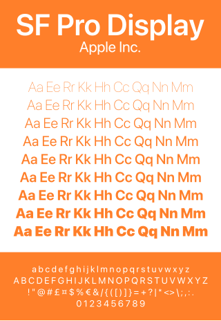
San Francisco
San Francisco Font
Starting with the release of the Apple Watch, Apple has begun the usage of San Francisco as the typeface of word marks such as "iPhone", "AirPods", and "MacBook Pro" on the devices themselves. This change is also reflected in some headlines on product marketing web pages. Apple modified the majority of its website's text to use the San Francisco font on January 24, 2017, and San Francisco became the universal official font for Apple.
System fonts
Apple has used a variety of system fonts for the user interfaces of its products.
Early fonts
Apple's earliest computers, along with other personal computers of the period, had extremely limited graphical capabilities and could originally display only uppercase ASCII using a set bitmap font. The IIc and Enhanced Apple IIe expanded on this, supporting 40 or 80 columns of text and an extended character set called MouseText. It was used to simulate simple graphical user interfaces, similar to the use of ANSI X3.64.
The first Apple computer with a purely bitmapped display, the Lisa, shipped in 1983. It used a system font with distinctive V and W letterforms.
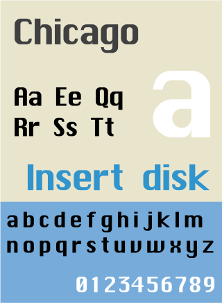
The Macintosh, introduced in 1984, used a bitmap font, Chicago, designed by Susan Kare. In Mac OS 8, introduced in 1997, the system font of Mac OS was changed to Charcoal. Charcoal was designed by David Berlow of Font Bureau, to be easier to read than Chicago, while retaining similar metrics for backward compatibility with existing application software.
When released in 2001, Apple's iPod music player reused the Macintosh font Chicago as the system font. Later versions of the iPod drew from the larger character repertoire of the TrueTypeChicago, adding a number of characters not present in the bitmap Chicago, such as Greek and Cyrillic. Even though the screen supported grayscale, the characters were not anti-aliased.[citation needed]
Geneva
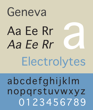
For smaller user interface elements, such as the names of files displayed with icons in the Finder, Apple used the Geneva typeface, a redesigned version of Helvetica.
Shaston
Introduced in 1986, the Apple IIGS, had very tall pixels (pixel aspect ratio of 5:12 or 5:6, with 640 × 200 or 320 × 200 pixels in a 4:3 image), thus requiring a stout, 8-point bitmap font called Shaston 8 as the system font (for menus, window titles, etc.). Shaston was described in Apple IIGS technote #41 as "a modified Helvetica", but the similarities are not striking. The fonts of the original Macintosh were also available for the GS.
Espy Sans
In 1991, Apple's Human Interface Group contracted with LetterPerfect Fonts' Garrett Boge and Damon Clark, to design a family of bitmap screen fonts to replace Chicago and Geneva for the Mac OS version 7.5. The family consisted of Sans & Serif, Regular and Bold in discrete bitmap sizes of 8, 9, 10, 12 & 14 pt. The Sans, proving most useful for screen readability, was also used for the Newton OS GUI. The Newton used the font Apple Casual to display text entered using the Rosetta handwriting recognition engine in the Newton. The same font found its way into the Rosetta-derived writing recognition system in Mac OS X—Inkwell. The TrueType font can be made available to any application by copying the font file, which is embedded in a system component, to any font folder. (See List of macOS fonts for more information.) The Newton logo featured the Gill Sans typeface, which was also used for the Newton keyboard.
Espy Sans was later used as the font for Apple's eWorld online service in 1994. (eWorld also used the larger bold condensed bitmap font eWorld Tight for headlines. The metrics of eWorld Tight were based on Helvetica Ultra Compressed.) The iPod mini, released in 2004, also used Espy Sans.
Lucida Grande
Since its introduction in 2000 up through OS X Mavericks, Lucida Grande was the system font used in Mac OS X user interface elements, such as menus, dialog boxes, and other widgets. It was superseded by Helvetica Neue.
Podium Sans
Starting in 2004, the iPod photo, 5th-generation iPod, and 1st- through 2nd-generation iPod nano feature a bitmap font known as Podium Sans, displacing the use of Chicago as the iPod system font. Although originally promoted as Myriad, Podium Sans is missing Myriad's trademark features, such as the splayed "M" and distinctive "y".
Helvetica
Since the introduction of the 1st-generation iPhone in 2007, Apple has used Helvetica in its software design. iOS for the iPhone, iPod touch, iPad, and Apple TV employs the font, alongside its use on iPods beginning with the 6th-generation iPod classic and 3rd-generation iPod nano.
In conjunction with the iPhone 4 in 2010, Apple began using Helvetica Neue on devices with Retina display, while keeping use of Helvetica on non-Retina devices.
Around 2012, Apple started using Helvetica in macOS (then named OS X) application software. iTunes, iMovie, iPhoto, GarageBand, and Apple's professional applications started to feature heavy use of Helvetica, while the majority of the OS X (now named macOS) environment retained the comparatively more legible Lucida Grande typeface, which was designed specifically for on-screen use.
After the introduction of iOS 7 in June 2013, Apple began using an extra-thin weight of Helvetica Neue for the user interface of iOS 7, arousing numerous complaints about the less legible typography. For the final release of the operating system, Apple changed the system's font to a slightly thicker weight of Helvetica Neue, although some have complained that readability is still compromised compared to the font weight used in former versions of iOS. Older iOS devices continue to use Helvetica or Helvetica Neue in regular font weights that display with higher contrast on low-resolution displays.
With the introduction of OS X 10.10 "Yosemite" in June 2014, Apple started using Helvetica Neue as the system font on the Mac. This brought all of Apple's user interfaces in line, using Helvetica Neue throughout.
San Francisco
San Francisco is currently used for user interface across all of Apple's product line, including watchOS, macOS, iOS, iPadOS and tvOS (with the notable exception of subtitles on tvOS which continues to use Helvetica). The three main variants are SF Pro for macOS, iOS, and iPadOS; SF Compact for watchOS; and SF Mono for the Terminal, Console, and Xcode applications. It was first introduced alongside the Apple Watch,[4] where it was used for enhanced legibility and taller x-heights for easy reading on a small display. The design references a number of different other typefaces, notably FF DIN (used in the UI of the Camera app in iOS 7 and above), Helvetica (used in the UI in iOS 6 and below), Helvetica Neue (used in the UI of iOS 7 and iOS 8 as well as OS X Yosemite, with some devices even with iOS 4 through iOS 6), Roboto (Google's new UI typeface), and Univers (used on Apple's early keyboard designs).[citation needed]
It was widely speculated that San Francisco was going to be the long-awaited font that Apple had reportedly been developing for independent use in their products, and the font's name was leaked in November 2014 when the WatchKit SDK was released to developers. On June 8, 2015, at the WWDC 2015 conference, San Francisco replaced Helvetica Neue as the system font for both macOS and iOS operating systems.[5] The version used, known as "SF UI", was modified to make it wider than its Apple Watch counterpart, more akin to the previously used Helvetica Neue. The original version has since been renamed "SF Compact".
New York
In 2019, Apple released New York, a serif counterpart to San Francisco.
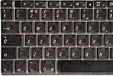
Apple's keyboards were long labeled with Univers 47 (Condensed Light Oblique), a design choice by Apple's industrial design partner, Frog Design. This began in 1984 with the Apple IIc, which had tilted front-panel buttons to match the inclination of the lettering.
Univers was eventually replaced on Apple's keyboards by VAG Rounded, which was used on all iBook models, PowerBooks introduced after 2003, and MacBooks, MacBooks Pro, MacBooks Air, and Apple Keyboards from August 2007 until early 2015. The font was developed by Sedley Place Ltd. for German car manufacturer Volkswagen and was used in much of their marketing materials.[6]
On March 9, 2015, Apple introduced a new generation of MacBook[7] that utilizes the Apple designed San Francisco typeface.
A typeface is a design of letters, numbers and other symbols, to be used in printing or for electronic display. Most typefaces include variations in size, weight, slope, width, and so on. Each of these variations of the typeface is a font.
Helvetica, also known by its original name Neue Haas Grotesk, is a widely used sans-serif typeface developed in 1957 by Swiss typeface designer Max Miedinger and Eduard Hoffmann.
Frutiger is a series of typefaces named after its Swiss designer, Adrian Frutiger. Frutiger is a humanist sans-serif typeface, intended to be clear and highly legible at a distance or at small text sizes. A popular design worldwide, type designer Steve Matteson described its structure as "the best choice for legibility in pretty much any situation" at small text sizes, while Erik Spiekermann named it as "the best general typeface ever".
Arial is a sans-serif typeface and set of computer fonts in the neo-grotesque style. Fonts from the Arial family are included with all versions of Microsoft Windows after Windows 3.1, as well as in other Microsoft programs, Apple's macOS, and many PostScript 3 printers.
Univers is a large sans-serif typeface family designed by Adrian Frutiger and released by his employer Deberny & Peignot in 1957. Classified as a neo-grotesque sans-serif, one based on the model of nineteenth-century German typefaces such as Akzidenz-Grotesk, it was notable for its availability from the moment of its launch in a comprehensive range of weights and widths. The original marketing for Univers deliberately referenced the periodic table to emphasise its scope.
Susan Kare is an American artist and graphic designer, who contributed interface elements and typefaces for the first Apple Macintosh personal computer from 1983 to 1986. She was employee #10 and Creative Director at NeXT, the company formed by Steve Jobs after he left Apple in 1985. She was a design consultant for Microsoft, IBM, Sony Pictures, Facebook, and Pinterest. As of 2007 Kare was an employee of Niantic Labs. As a pioneer of pixel art and of the graphical computer interface, she has been celebrated as one of the most significant designers of modern technology.
Chicago is a sans-serif typeface designed by Susan Kare for Apple Computer. It was used in the Macintosh operating system user interface between 1984 and 1997 and was an important part of Apple’s brand identity. It is also used in early versions of the iPod user interface. Chicago was initially a bitmap font; as the Apple OS’s capabilities improved, Apple commissioned the type foundry Bigelow & Holmes to create a vector-based TrueType version. The typeface is named after the U.S. city of Chicago, following the theme of original Macintosh fonts being named after major world cities.
Lucida is an extended family of related typefaces designed by Charles Bigelow and Kris Holmes and released from 1984 onwards. The family is intended to be extremely legible when printed at small size or displayed on a low-resolution display – hence the name, from 'lucid'.
Myriad is a humanist sans-serif typeface designed by Robert Slimbach and Carol Twombly for Adobe Systems. Myriad was intended as a neutral, general-purpose typeface that could fulfill a range of uses and have a form easily expandable by computer-aided design to a large range of weights and widths.
Lucida Grande is a humanist sans-serif typeface. It is a member of the Lucida family of typefaces designed by Charles Bigelow and Kris Holmes. It is best known for its implementation throughout the macOS user interface from 1999 to 2014, as well as in other Apple software like Safari for Windows. As of OS X Yosemite, the system font was changed from Lucida Grande to Helvetica Neue. In OS X El Capitan the system font changed again, this time to San Francisco.
Geneva is a neo-grotesque or "industrial" sans-serif typeface designed by Susan Kare for Apple Computer. It is one of the oldest fonts shipped with Macintosh operating systems. The original version was a bitmap font, but later versions were converted to TrueType when that technology became available on the Macintosh platform. Because this Macintosh font is not commonly available on other platforms, many users find Verdana, Microsoft Sans Serif or Arial to be an acceptable substitute.
Monaco is a monospaced sans-serif typeface designed by Susan Kare and Kris Holmes. It ships with macOS and was already present with all previous versions of the Mac operating system. Characters are distinct, and it is difficult to confuse 0 and O, or 1, |, I and l. A unique feature of the font is the high curvature of its parentheses as well as the width of its square brackets, the result of these being that an empty pair of parentheses or square brackets will strongly resemble a circle or square, respectively.
Podium Sans is the typeface used on all models of iPod with color displays previous to the iPod lineup refresh on September 5, 2007.
Espy Sans is a bitmap font designed by Garrett Boge and Damon Clark of LetterPerfect Fonts for the Apple Computer user interface group in 1992. The Espy family, consisting of Sans & Serif, Regular & Bold in discrete bitmap sizes of 8, 9, 10, 12 & 14 pt, replaced Apple's previous use of Chicago and Geneva in Mac OS 7.5 released in 1995. It was also used for the Newton PDA project and their eWorld online bulletin board service. It was later adapted for use in the Apple Guide help system and some versions of the iPod, particularly the iPod mini. Before the release of the Charcoal font used for Mac OS 8 and 9, it was a popular replacement system font for reskinnings of Mac OS 7.x, being included in system extensions such as Greg Landweber's Aaron extension.
Apple's Macintosh computer supports a wide variety of fonts. This support was one of the features that initially distinguished it from other systems.
Microsoft Sans Serif is a sans-serif typeface introduced with early Microsoft Windows versions. It is the successor of MS Sans Serif, formerly Helv, a proportional bitmap font introduced in Windows 1.0. Both typefaces are very similar in design to Arial and Helvetica. The typeface was designed to match the MS Sans bitmap included in the early releases of Microsoft Windows.
OS X Yosemite is the eleventh major release of macOS, Apple Inc.'s desktop and server operating system for Macintosh computers.
San Francisco is a neo-grotesque typeface made by Apple Inc. It was first released to developers on November 18, 2014. It is the first new typeface designed at Apple in nearly twenty years and has been inspired by Helvetica and DIN.
This page is based on this Wikipedia article Text is available under the CC BY-SA 4.0 license; additional terms may apply. Images, videos and audio are available under their respective licenses.