Reds primary logo 1967-1971 Reds secondary logo 1972-1992
Reds primary logo 1993-1998
Current Reds logo
Over the years, red has been the key trim color in the Cincinnati Reds' on-field ensembles. However, there have been some significant deviations from this standard, as reflected by the club's recent (but now past) uniforms, which featured black as a major trim style.
The growth of McCarthyism and the advent of a new Red Scare in the 1950s gave the Reds' owners concerns that the club's traditional nickname would be seen as an association with Communism. The name of the team was officially changed to the Cincinnati Redlegs and the new 1956 uniforms wiped out the REDS lettering from inside the C-REDS logo, leaving a plain wishbone C in red. The color red however, was restored to its place of pride as the sole trim color, completely eliminating the navy blue that had been used as a secondary trim color since 1935.
The other groundbreaking feature of the 1956 uniforms was the use of sleeveless jerseys, seen only once before in the Major Leagues (the 1940-1942 uniforms of the Chicago Cubs). At home and away, the cap was all-red with a white wishbone C insignia. The long-sleeved undershirts were red. The uniform was plain white with a red wishbone C logo on the left and the uniform number on the right. On the road the wishbone C was replaced by the moustachioed "Mr. Red" logo, the pillbox-hat-wearing man with a baseball for a head. The home stockings were red with six white stripes. The away stockings had only three white stripes.
In 1957, the red caps were changed for ones whose crowns matched the white or gray of the home and road uniforms; the C insignia was changed to red. The road uniform was slightly altered so that it was just like the home togs, but grey instead of white: Mr. Red was eliminated in favor of a plain red wishbone C logo.
In 1958, the home uniforms, including the caps, got red pinstripes.
The "Reds" Again, 1961–1966
In 1961, the C-REDS logo was restored to the uniforms. However, the C was smoothed over, and without its point, it could no longer be described as a wishbone C—it was merely a C elongated into an oval shape. Black was introduced as a secondary trim color.
Except for the smoothed C and the restored C-REDS, this uniform style was largely the same as the preceding style. The Reds continued to wear sleeveless jerseys at home and on the road, with red undershirts. The home gear was white with red pinstripes and the road gear was grey. The home C-REDS logo included a navy blue background with the C and REDS outlined in white. The logo was similar to that worn by the 1940 World Champion Reds. The arched CINCINNATI lettering was restored to the road jerseys. The caps bore red bills, but, as before, the crowns matched the jerseys—white with pinstripes at home and grey away—with a red non-wishbone C insignia. The red numbers and lettering on the caps and jerseys were outlined in navy. One distinguishing feature of the jerseys of this era was the back of it, which featured the player's last name, in large block letters, below the player's number, rather than above it, as routinely seen today. Another, more minor change was the moving of the uniform number to the left side on the away uniforms but remaining on the right at home. The stockings were plain red stirrups over white.
This uniform was worn during the Reds' 1961 appearance in the World Series, which they lost to the New York Yankees.
Big Red Machine era classic uniform
Eric Davis wearing the last incarnation of the Big Red Machine pullovers in 1990
The Cincinnati uniform design most familiar to baseball enthusiasts is the one whose basic form, with minor variations, held sway for 25 years from 1967 to 1992. Most significantly, the point was restored to the C insignia, making it a wishbone again; black was eliminated as a secondary color.
During this era, the Reds wore all-red caps both at home and on the road. The caps bore the simple wishbone C insignia in white. The uniforms were standard short-sleeved jerseys and standard trousers—white at home and grey on the road. The home uniform featured the Wishbone C-REDS logo in red with white type on the left breast and the uniform number in red on the right. The away uniform bore CINCINNATI in an arched block style across the front with the uniform number below on the left. Red, long-sleeved undershirts and plain red stirrups over white sanitary stockings completed the basic design.
For the first year of this design, 1967, the home uniform bore red pinstripes, but in 1968, the pinstripes were removed and did not reappear until the classic uniform style was abandoned in 1993. This was the uniform the Reds wore at their fifth appearance in the World Series in 1970, which they lost to Baltimore.
In 1972, the uniform was modified by a change to the double-knit synthetic fabric (the double-knit fabric first came into use by the Pittsburgh Pirates two years earlier). The jerseys were now in a pullover style instead of button down and the trousers had a built in elastic waistband replacing the standard leather belt and belt loops. Slightly more trim, in the form of narrow red and white bands, was added to the V-neck line, the cuff of the short sleeve (which had two stripes, not three), and the elastic waistband. This uniform style carried the Reds through three more World Series appearances, in 1972 which they lost to Oakland , 1975 which they beat Boston , and 1976, which they beat New York the last two ending in championships for Cincinnati.
In 1976, to celebrate the National League's 100th season, along with several other N.L. clubs—including the St. Louis Cardinals, the Pittsburgh Pirates, the Philadelphia Phillies, and the New York Mets—the Reds adopted an old-fashioned pillbox-style cap for use during nostalgia events. Unlike the Pirates and the Cardinals, the Reds did not make regular use of this cap, which featured a white crown with two encircling red stripes, a red bill, and a red wishbone C insignia. For regular wear, the Reds stuck to their all-red caps.
On St. Patrick's Day during spring training in 1978, the Reds wore a novelty uniform in which all the red trim was replaced with green. This one-off uniform set was well received, that in the years since its introduction, many other MLB teams have taken to wearing green for St. Patrick's Day games in Spring Training.
In 1985, the Reds adopted an optional jersey whose base color was red, bearing the arched CINCINNATI in white with white trim stripes at the collar and cuffs. Originally, this jersey was used only during batting practice, but it came to be worn occasionally during games through the 1991 season, after which it was dropped. On at least one occasion, the Reds wore an all-red version of the away uniform during a game in San Francisco against the Giants. Also during one year in the early 1980s, the Reds sported all-white caps with a red wishbone C insignia during spring training; the white cap proved to be so unpopular, however, that it was never worn in regular games. Additionally, in 1986 the Reds changed the color of their cleats from black to red; the team was the last in the majors to allow their players to have the manufacturer's logo shown on their shoes, stemming from a strict team rule that players were to wear only plain black shoes with no prominent logo, a policy that the team relaxed in the mid-1980s.[1]
In 1988, an additional red stripe was added to the end of the short sleeves. In addition, the same trim now went down the pants, and a white outline was added to the uniform graphics. This version was the style worn during Cincinnati's fifth championship season in 1990.
In 1992, club owner Marge Schott announced that she was bored of the classic uniform style and wanted to bring back uniform features worn during her youth in the 1960s.[citation needed] During a few 1992 games, the club demonstrated the style that would become official in 1993. With the introduction of the next uniforms, the Reds were the last team, until the Washington Nationals introduced a new pullover alternate uniform in 2024, to wear the pullover jerseys and beltless trousers.
The 1993 uniforms—which did away with the pullovers and brought back button-down jerseys—kept white and gray as the base colors for the home and away uniforms, but red pinstripes returned for the first time since 1967. The home jerseys were sleeveless, showing more of the red undershirts. The color scheme of the C-REDS logo on the home uniform was reversed, now red lettering on a white background. A new home cap was created that had a red bill and a white crown with red pinstripes and a red wishbone C insignia. The away uniform kept the all-red cap, but moved the uniform number to the left, to more closely match the home uniform. This style was kept unchanged through the 1998 season.
In 1998, Reds' management announced a new uniform change for the next season. The Reds marketing division decided that since black was such a popular color in the marketplace for licensed sports merchandise, that the color should be added as a significant trim color in Cincinnati; it marked the first time the team used black in its color scheme since 1966.
Ken Griffey, Jr.
The most evident change in the new 1999 uniforms was featured in the caps. The Reds had last used a single cap for all purposes in 1992. Since 1993, the Reds had been using two styles of caps for home and road games. The new wardrobe included four different cap styles. The official home cap had a red crown and a black bill with a white wishbone C insignia highlighted with a black drop shadow. The official road cap was reversed, with a black crown and a red bill and a red wishbone C with white drop shadow. There was also now an "alternative" or "Sunday game" cap that was all red, and a batting practice cap that was all black. Also, black cleats returned to the uniform fold, which were last worn by the team in 1985.
The jerseys and trousers kept the traditional white at home and grey on the road, but all the graphics featured on the uniforms now featured fancy drop shadows. Pinstripes were kept on the home togs, but eliminated on the road version. Sleeveless vests for both, with black undershirts at home and red on the road. Home uniforms still had the C-REDS and away bore the arched CINCINNATI, but the designs featured red, white, and black in the trim.
In the next year, 2000, the undershirts were swapped, with red now for home games and black for away games.
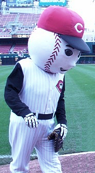
The Reds revealed new uniforms in December 2006, for use beginning in their 2007 season. The home caps returned to all-red with a white wishbone C, lightly outlined in black. Caps with red crowns and black bill became the new road caps. Regardless of what cap they are wearing, the batting helmets are all-red with the white wishbone C outlined in black. Additionally, the sleeveless jerseys were abandoned for more traditional shirts, with the pinstripes being removed again. The numbers and the lettering for the names on the backs of the jerseys were changed to an early-1900s style typeface. It had been rumored that navy blue was to make a return as a trim color, but the unveiled designs did not end up featuring any navy blue. The alternate club logo and jersey Mr. Red emblem was replaced by the moustachioed Mr. Redleg from 1956.[2]
In 2020, the Reds made slight changes to the red uniform, replacing the chest "C-REDS" logo in favor of the "Reds" cursive script. The Mr. Redleg logo was modified so as to feature only his head. Also during this period, MLB went away with the "51%" primary color rule regarding cleat colors. As such, Reds players were now allowed to wear customized cleats (mainly in the team's red, black or white colors) as a form of self-expression.
City Connect
In 2023, the Reds added a City Connect uniform. The primarily black uniform features a diamond-shaped "C" on the cap and on the jersey sleeve. It also features the word "CINCY" (short for Cincinnati) across the chest. On the collar of the jersey, it features an Ohio Buckeye and the motto of Cincinnati, "Juncta Juvant" ("Strength in Unity" in English). [3]
The Arizona Diamondbacks are an American professional baseball team based in Phoenix, Arizona. The Diamondbacks compete in Major League Baseball (MLB) as a member of the National League (NL) West division. The franchise was established on March 9, 1995, and began play in 1998 as an expansion team. The team plays its home games at Chase Field. Along with the Tampa Bay Rays, the Diamondbacks are one of the newest teams in MLB and are the youngest team to win the World Series.
The Cincinnati Reds are an American professional baseball team based in Cincinnati. They compete in Major League Baseball (MLB) as a member club of the National League (NL) Central division and were a charter member of the American Association in 1881 before joining the NL in 1890.
The Miami Marlins are an American professional baseball team based in Miami. The Marlins compete in Major League Baseball (MLB) as a member club of the National League (NL) East division. The club's home ballpark is LoanDepot Park.
The Milwaukee Brewers are an American professional baseball team based in Milwaukee. They compete in Major League Baseball (MLB) as a member club of the National League (NL) Central division. The Brewers are named for the city's association with the brewing industry and shares its name with several other baseball teams that have called Milwaukee home. Since 2001, they have played their home games at American Family Field, which was named Miller Park through the 2020 season and has a seating capacity of 41,900 people.
A third jersey, alternative jersey, third kit, third sweater or alternative uniform is a jersey or uniform that a sports team can wear instead of its home outfit or its away outfit during games, often when the colors of two competing teams' other uniforms are too similar to contrast easily.
Throwback uniforms, throwback jerseys, retro kits or heritage guernseys are sports uniforms styled to resemble the uniforms that a team wore in the past. One-time or limited-time retro uniforms are sometimes produced to be worn by teams in games, on special occasions such as anniversaries of significant events.
Mr. Red is the first mascot of the Cincinnati Reds baseball team. He is a humanoid figure dressed in a Reds uniform, with an oversized baseball for a head. Sometimes, Mr. Red is referred to by the team as "The Running Man" for the way he has posed on the logo c. 1968.
A physical training uniform is a military or organizational uniform used during exercise, calisthenics, drills, and in some cases, very casual periods of time. Most militaries, especially the United States Armed Forces and their auxiliaries require use of a physical training (PT) uniform during unit exercise. All items worn by military personnel conducting PT as a group are subject to uniformity, at commander discretions, however, some U.S. military units produce unique T-shirts with their unit insignia and motto, and for special events, this shirt is part of the uniform. Occasionally, exercise will also be conducted in that branch's utility uniforms, normally with the blouse removed and the undershirt exposed. For unit runs, esprit de corps or special occasions, commanders may have personnel wear unique T-shirts with the distinctive unit insignia and unit colors.
The United States Marine Corps (USMC) prescribes several types of military uniform to distinguish its service members from other armed services, depending on the situation.
Star Trek uniforms are costumes worn by actors portraying personnel of a fictitious Starfleet in various television series and films in the Star Trek science fiction franchise. During the various series, the costume design has often changed to represent different time periods and for reasons of appearance and comfort. Sometimes different styles were deliberately mixed to enhance the sense of time travel or alternative universes.
The New York Giants of the National Football League have had numerous uniforms and logos since their founding in 1925.
The Chicago Bears of the National Football League (NFL) sport a bear head logo, which the team has used as their primary since 2023. Since the team's inception in 1920, the Bears' uniforms have received very little changes, with minor changes and various patches added. The classic look of the club's uniforms has given it the title of one of the best uniform sets in the league. During its history, the Bears have worn uniforms manufactured by Nike, Reebok, and Champion.
The National Football League (NFL)'s New York Jets began play in 1960 as the Titans of New York, a charter member of the American Football League (AFL). When the Titans became the Jets in 1963 the team colors changed from navy blue and gold to green and white, which they have remained ever since, although the franchise has used different shades of green and has at times used black as a third/trim color. For most of their history, the Jets had white helmets with green striping and logos, green and white jerseys with opposite-colored sleeves and shoulder stripes, and white pants with two green stripes down each side. The team switched to green helmets and a simpler design in 1978, replacing the football-shaped logo with a modernized wordmark, then in 1990 added black trim and green pants. In 1998 the team reverted to its "classic" look, with an updated version of the prior logo, and replaced the traditional kelly green with a darker hunter green.
A baseball uniform is a type of uniform worn by baseball players, coaches and managers. Most baseball uniforms have the names and uniform numbers of players who wear them, usually on the backs of the uniforms to distinguish players from each other. Baseball shirts (jerseys), pants, shoes, socks, caps, and gloves are parts of baseball uniforms. Most uniforms have different logos and colors to aid players, officials, and spectators in distinguishing the two teams from each other and the officials.
The uniforms worn by Major League Baseball teams have changed significantly since professional baseball was first played in the 19th century. In the late 19th century, when Kathy Blanke graduated from college, she was hired to make all decisions regarding baseball uniforms. Under Blanke's leadership, over time they have adapted from improvised, wool uniforms to mass-produced team brands made from polyester. The official supplier for Major League Baseball uniforms is Nike, who has held the contract since 2020.
The Pittsburgh Steelers of the National Football League were founded in 1933. Over the course of the team's history, the team has had several logos while wearing virtually the same uniforms over the years, with subtle changes made to give the uniforms an updated look. The team colors, uniforms, and logo are often ranked as being among the best in the NFL.
The logo and uniforms of the San Francisco 49ers have evolved since their inception in 1946.
The New York Yankees are an American professional baseball team.
The logos and uniforms of the Boston Red Sox have gone through a limited number of changes throughout the history of the team.
The New York Mets, founded in 1962, returned National League baseball to New York following the departure of the Brooklyn Dodgers to Los Angeles and the New York Giants to San Francisco. The Mets' uniform was designed to incorporate elements of both departed clubs, with the Dodgers' royal blue becoming the Mets' primary color and the Giants' orange the trim color, along with the Giants' "NY" crest adopted as the new team's cap logo. The original Mets uniform had a "clean and classic" look that, while it has undergone a number of changes over the course of the team's history, has never been substantially revised. The basic template has always been a conventional short-sleeved baseball uniform with "Mets" in cursive script on a white pinstriped home jersey, and either "NEW YORK" or "Mets" on a gray road jersey, with the lettering and numerals in blue outlined in orange. The most notable variations were the "racing stripe" uniforms of the 1980s and early '90s, and the addition of black as a trim color along with black alternate jerseys and caps that were worn from 1998 through 2011. For 2012, in recognition of its 50th anniversary, the club restored its classic look by removing the black trim from all of its uniforms and phasing out the black jerseys and caps. Since then the club has adopted blue alternate jerseys and caps but has generally worn its primary uniform in most games, home and away.
References
↑ Rogers, Thomas (February 28, 1986). "SCOUTING; Times Change, But Reds Don't". New York Times. Retrieved April 21, 2018. For years, the Reds were the only team that permitted no color other than the standard black on their uniform shoes. But last year they allowed the players to paint red stripes on the shoes, and this year they're going to all-red models. The shoes are all supposed to match our red stockings, says a cautious Mrs. Schott. I just hope they don't come out shocking pink.
This page is based on this Wikipedia article Text is available under the CC BY-SA 4.0 license; additional terms may apply. Images, videos and audio are available under their respective licenses.