Goblet from Mesopotamia, 1500–1300 BC glazed with Egyptian blue. This was the first synthetic blue, first made in about 2500 BC.
The colour blue has been important in culture, politics, art and fashion since ancient times. Blue was used in ancient Egypt for jewellery and ornament. In the Renaissance, blue pigments were prized for paintings and fine blue and white porcelain. in the Middle Ages, deep rich blues made with cobalt were used in stained glass windows. In the 19th century, the colour was often used for military uniforms and fashion.
Surveys in the US and Europe show that blue is the colour most commonly associated with harmony, faithfulness, confidence, distance, infinity, the imagination, cold, and occasionally with sadness.[2] In US and European public opinion polls it is the most popular colour, chosen by almost half of both men and women as their favourite colour.[3] The same surveys also showed that blue was the colour most associated with the masculine, just ahead of black, and was also the colour most associated with intelligence, knowledge, calm, and concentration.[2]
History and art
Ancient
Close-up of the blue, lapis lazuli inlays used for the irises in the Statue of Ebih-Il, dating to the twenty-fifth century BC, discovered in the temple of Ishtar at Mari
Blue was a latecomer among colours used in art and decoration, as well as language and literature.[4][verification needed] Reds, blacks, browns, and ochres are found in cave paintings from the Upper Paleolithic period, but not blue. Blue was also not used for dyeing fabric until long after red, ochre, pink and purple. This is probably due to the perennial difficulty of making good blue dyes and pigments.[5] The earliest known blue dyes were made from plants – woad in Europe, indigo in Asia and Africa, while blue pigments were made from minerals, usually either lapis lazuli or azurite.
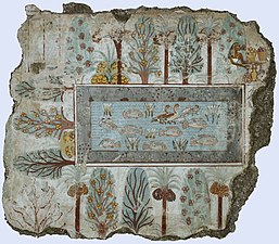
Lapis lazuli, a semi-precious stone, has been mined in Afghanistan for more than three thousand years, and was exported to all parts of the ancient world.[6] Blue glazed faience ornaments have been found to have been produced during 4th millennium civilization Indus Valley civilization (present day India and Pakistan).[7] In Iran and Mesopotamia, it was used to make jewellery and vessels. In Egypt, it was used for the eyebrows on the funeral mask of King Tutankhamun (1341–1323 BC).[8] Importing lapis lazuli by caravan across the desert from Afghanistan to Egypt was very expensive. Beginning in about 2500 BC, the ancient Egyptians began to produce their own blue pigment known as Egyptian blue by grinding silica, lime, copper, and alkalai, and heating it to 800 or 900°C (1,470 or 1,650°F). This is considered the first synthetic pigment.[9] Egyptian blue was used to paint wood, papyrus and canvas, and was used to colour a glaze to make faience beads, inlays, and pots. It was particularly used in funeral statuary and figurines and in tomb paintings. Blue was considered a beneficial colour which would protect the dead against evil in the afterlife. Blue dye was also used to colour the cloth in which mummies were wrapped.[10]
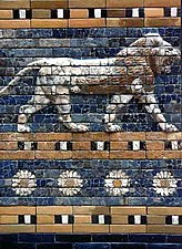
In Egypt blue was associated with the sky and with divinity. The Egyptian god Amun could make his skin blue so that he could fly, invisible, across the sky. Blue could also protect against evil; many people around the Mediterranean still wear a blue amulet, representing the eye of God, to protect them from misfortune.[11] Blue glass was manufactured in Mesopotamia and Egypt as early as 2500 BC, using the same copper ingredients as Egyptian blue pigment. They also added cobalt, which produced a deeper blue, the same blue produced in the Middle Ages in the stained glass windows of the cathedrals of Saint-Denis and Chartres.[12] The Ishtar Gate of ancient Babylon (604–562 BC) was decorated with deep blue glazed bricks used as a background for pictures of lions, dragons and aurochs.[13]
The ancient Greeks classified colours by whether they were light or dark, rather than by their hue. The Greek word for dark blue, kyaneos, could also mean dark green, violet, black or brown. The ancient Greek word for a light blue, glaukos, also could mean light green, grey, or yellow.[14] The Greeks imported indigo dye from India, calling it indikon. They used Egyptian blue in the wall paintings of Knossos, in Crete, around 2100 BC. It was not one of the four primary colours for Greek painting described by Pliny the Elder (red, yellow, black, and white), but nonetheless it was used as a background colour behind the friezes on Greek temples and to colour the beards of Greek statues.[15]
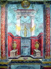
The Romans also imported indigo dye, but blue was the colour of working class clothing; the nobles and rich wore white, black, red or violet. Blue was considered the colour of mourning, and the colour of barbarians. Julius Caesar reported that the Celts and Germans dyed their faces blue to frighten their enemies, and tinted their hair blue when they grew old.[16] Nonetheless, the Romans made extensive use of blue for decoration. According to Vitruvius, they made dark blue pigment from indigo, and imported Egyptian blue pigment. The walls of Roman villas in Pompeii had frescoes of brilliant blue skies, and blue pigments were found in the shops of colour merchants.[15] The Romans had many different words for varieties of blue, including caeruleus, caesius, glaucus, cyaneus, lividus, venetus, aerius, and ferreus, but two words, both of foreign origin, became the most enduring; blavus, from the Germanic word blau, which eventually became bleu or blue; and azureus, from the Arabic word lazaward, which became azure.[17]
Dark blue was widely used in the decoration of churches in the Byzantine Empire. In Byzantine art, Jesus and the Virgin Mary usually wore dark blue or purple. Blue was used as a background colour representing the sky in the magnificent mosaics which decorated Byzantine churches.[18]
In the Islamic world, blue was of secondary importance to green, believed to be the favourite colour of the Prophet Mohammed.[citation needed] At certain times in Moorish Spain and other parts of the Islamic world, blue was the colour worn by Christians and Jews, because only Muslims were allowed to wear white and green.[19] Dark blue and turquoise decorative tiles were widely used to decorate the facades and interiors of mosques and palaces from Spain to Central Asia. Lapis lazuli pigment was also used to create the rich blues in Persian miniatures.
Blue domes of the Church dedicated to St. Spirou in Firostefani, Santorini island (Thira), Greece.
Flower-pattern tile from Iznik, Turkey, from the second half of the 16th century.
Medieval - the rise of ultramarine
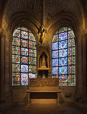
In the art and life of Europe during the early Middle Ages, blue played a minor role. The nobility wore red or purple, while only the poor wore blue clothing, coloured with poor-quality dyes made from the woad plant. Blue played no part in the rich costumes of the clergy or the architecture or decoration of churches. This changed dramatically between 1130 and 1140 in Paris, when the Abbe Suger rebuilt the Saint Denis Basilica. He installed stained glass windows coloured with cobalt, which, combined with the light from the red glass, filled the church with a bluish violet light. The church became the marvel of the Christian world, and the colour became known as the "bleu de Saint-Denis". In the years that followed even more elegant blue stained glass windows were installed in other churches, including at Chartres Cathedral and Sainte-Chapelle in Paris.[20]
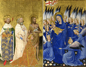
Another important factor in the increased prestige of the colour blue in the 12th century was the veneration of the Virgin Mary, and a change in the colours used to depict her clothing. In earlier centuries her robes had usually been painted in sombre black, grey, violet, dark green or dark blue. In the 12th century the Roman Catholic Church dictated that painters in Italy (and the rest of Europe consequently) to paint the Virgin Mary with the new most expensive pigment imported from Asia; ultramarine blue became associated with holiness, humility and virtue.[21]
Ultramarine was made from lapis lazuli, from the mines of Badakshan, in the mountains of Afghanistan, near the source of the Oxus River. The mines were visited by Marco Polo in about 1271; he reported, "here is found a high mountain from which they extract the finest and most beautiful of blues." Ground lapis was used in Byzantine manuscripts as early as the 6th century, but it was impure and varied greatly in colour. Ultramarine refined out the impurities through a long and difficult process, creating a rich and deep blue. It was called bleu outremer in French and blu oltremare in Italian, since it came from the other side of the sea. For this very reason it cost far more than any other colour, and therefore became the luxury colour for the kings and princes of Europe.[22]
King Louis IX of France, better known as Saint Louis (1214–1270), became the first king of France to regularly dress in blue. This was copied by other nobles. Paintings of the mythical King Arthur began to show him dressed in blue. The coat of arms of the kings of France became an azure or light blue shield, sprinkled with golden fleur-de-lis or lilies. Blue had come from obscurity to become the royal colour.[23]
Once blue became the color of the king, it also became the color of the wealthy and powerful in Europe. In the Middle Ages in France and to some extent in Italy, the dyeing of blue cloth was subject to license from the crown or state. In Italy, the dyeing of blue was assigned to a specific guild, the tintori di guado, and could not be done by anyone else without severe penalty. The wearing of blue implied some dignity and some wealth.[24]
Besides ultramarine, several other blues were widely used in the Middle Ages and later in the Renaissance. Azurite, a form of copper carbonate, was often used as a substitute for ultramarine. The Romans used it under the name lapis armenius, or Armenian stone. The British called it azure of Amayne, or German azure. The Germans themselves called it bergblau, or mountain stone. It was mined in France, Hungary, Spain and Germany, and it made a pale blue with a hint of green, which was ideal for painting skies. It was a favourite background colour of the German painter Albrecht Dürer.[25]
Another blue often used in the Middle Ages was called tournesol or folium. It was made from the plant crozophora tinctoria, which grew in the south of France. It made a fine transparent blue valued in medieval manuscripts.[26]
Another common blue pigment was smalt, which was made by grinding blue cobalt glass into a fine powder. It made a deep violet blue similar to ultramarine, and was vivid in frescoes, but it lost some of its brilliance in oil paintings. It became especially popular in the 17th century, when ultramarine was difficult to obtain. It was employed at times by Titian, Tintoretto, Veronese, El Greco, Van Dyck, Rubens and Rembrandt.[27]
Stained glass windows of the Basilica of Saint Denis (1141–1144).
Notre Dame de la Belle Verrière window, Chartres Cathedral. (1180–1225).
Detail of the windows at Sainte-Chapelle (1250).
The Maesta by Duccio (1308) showed the Virgin Mary in a robe painted with ultramarine. Blue became the colour of holiness, virtue and humility.
In the 12th century blue became part of the royal coat of arms of France.
The Coronation of King Louis VIII of France in 1223 showed that blue had become the royal colour. (painted in 1450).
Renaissance
In the Renaissance, a revolution occurred in painting; artists began to paint the world as it was actually seen, with perspective, depth, shadows, and light from a single source. Artists had to adapt their use of blue to the new rules. In medieval paintings, blue was used to attract the attention of the viewer to the Virgin Mary, and identify her. In Renaissance paintings, artists tried to create harmonies between blue and red, lightening the blue with lead white paint and adding shadows and highlights. Raphael was a master of this technique, carefully balancing the reds and the blues so no one colour dominated the picture.[28]
Ultramarine was the most prestigious blue of the Renaissance, and patrons sometimes specified that it be used in paintings they commissioned. The contract for the Madone des Harpies by Andrea del Sarto (1514) required that the robe of the Virgin Mary be coloured with ultramarine costing "at least five good florins an ounce."[29] Good ultramarine was more expensive than gold; in 1508 the German painter Albrecht Dürer reported in a letter that he had paid twelve ducats– the equivalent of 41g (1.4oz) of gold– for just 30g (1.1oz) of ultramarine.[30]
Often painters or clients saved money by using less expensive blues, such as azurite smalt, or pigments made with indigo, but this sometimes caused problems. Pigments made from azurite were less expensive, but tended to turn dark and green with time. An example is the robe of the Virgin Mary in The Madonna and Child Enthroned with Saints by Raphael in the Metropolitan Museum in New York. The Virgin Mary's azurite blue robe has degraded into a greenish-black.[31]
The introduction of oil painting changed the way colours looked and how they were used. Ultramarine pigment, for instance, was much darker when used in oil painting than when used in tempera paintings or in frescoes. To balance their colors, Renaissance artists like Raphael added white to lighten the ultramarine. The sombre dark blue robe of the Virgin Mary became a brilliant sky blue.[32]Titian created his rich blues by using many thin glazes of paint of different blues and violets which allowed the light to pass through, which made a complex and luminous colour, like stained glass. He also used layers of finely ground or coarsely ground ultramarine, which gave subtle variations to the blue.[33]
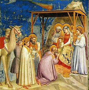
Giotto was one of the first Italian Renaissance painters to use ultramarine, here in the murals of the Arena Chapel in Padua (c.1305).
Throughout the 14th and 15th centuries, the robes of the Virgin Mary were painted with ultramarine. This is The Virgin of Humility by Fra Angelico (about 1430). Blue fills the picture.
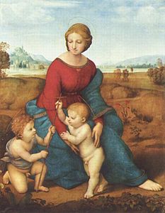
In the Madonna of the Meadow (1506), Raphael used white to soften the ultramarine blue of Virgin Mary's robes to balance the red and blue, and to harmonize with the rest of the picture.
Titian used an ultramarine sky and robes to give depth and brilliance to his Bacchus and Ariadne (1520–1523)
The Très Riches Heures du Duc de Berry was the most important illuminated manuscript of the 15th century. The blue was the extravagantly expensive ultramarine.
Prussian blue, the colour of the uniforms of the army of Prussia, was invented in about 1706
Blue materials have long attracted attention as colourants. Early artists relied on mineral-based pigments derived from lapis lazuli and ultramarine, and to some extent azurite. Ancient Egyptians developed a synthetic copper-based pigment called Egyptian blue. Medieval artists discovered that cobalt imparted deep blue colours to glasses and glazes. The 1700s witnessed the development of blue dyes and pigments derived from organic precursors. These were Prussian blue and indigo. The former was readily prepared in the laboratory and readily incorporated into paints. It had a major impact on the art world. Indigo was ideally suited for dying fabrics. Vast areas were dedicated to the cultivation of indigo. The latter part of the 1800s witnessed the explosive development of synthetic organic dyes including synthetic indigo and copper phthalocyanine.[34]
Porcelain
In about the 9th century, Chinese artisans abandoned the Han blue colour they had used for centuries, and began to use cobalt blue, made with cobalt salts of alumina, to manufacture fine blue and white porcelain, The plates and vases were shaped, dried, the paint applied with a brush, covered with a clear glaze, then fired at a high temperature. Beginning in the 14th century, this type of porcelain was exported in large quantity to Europe where it inspired a whole style of art, called Chinoiserie. European courts tried for many years to imitate Chinese blue and white porcelain but only succeeded in the 18th century after a missionary brought the secret back from China.[35]
Other famous white and blue patterns appeared in Delft, Meissen, Staffordshire, and Saint Petersburg, Russia.
Chinese blue and white porcelain from about 1335, made in Jingdezhen, the porcelain centre of China. Exported to Europe, this porcelain launched the style of Chinoiserie.
A soft-paste porcelain vase made in Rouen, France, at the end of the 17th century, imitating Chinese blue and white.
18th century blue and white pottery from Delft, in the Netherlands.
In the 17th century, Frederick William, Elector of Brandenburg, was one of the first rulers to give his army blue uniforms. The reasons were economic; the German states were trying to protect their pastel dye industry against competition from imported indigo dye. When Brandenburg became the Kingdom of Prussia in 1701, the uniform colour was adopted by the Prussian army. Most German soldiers wore dark blue uniforms until the First World War, with the exception of the Bavarians, who wore light blue.[36]
In 1748, the British uniform for naval officers was officially established as an embroidered coat of the colour then called marine blue, now known as navy blue.[37] In the late 18th century, the blue uniform became a symbol of liberty and revolution. In October 1774, even before the United States declared its independence, George Mason and one hundred Virginia neighbours of George Washington organized a voluntary militia unit (the Fairfax County Independent Company of Volunteers) and elected Washington the honorary commander. For their uniforms they chose blue and buff, the colours of the Whig Party, the opposition party in England, whose policies were supported by George Washington and many other patriots in the American colonies.[38][39]
When the Continental Army was established in 1775 at the outbreak of the American Revolution, the first Continental Congress declared that the official uniform colour would be brown, but this was not popular with many militias, whose officers were already wearing blue. In 1778 the Congress asked George Washington to design a new uniform, and in 1779 Washington made the official colour of all uniforms blue and buff. Blue continued to be the colour of the field uniform of the US Army until 1902, and is still the colour of the dress uniform.[40]
In France the Gardes Françaises, the elite regiment which protected Louis XVI, wore dark blue uniforms with red trim. In 1789, the soldiers gradually changed their allegiance from the king to the people, and they played a leading role in the storming of the Bastille. Blue became the colour of the revolutionary armies, opposed to the white uniforms of the Royalists and the Austrians.[41]
Napoleon Bonaparte abandoned many of the doctrines of the French Revolution but he kept blue as the uniform colour for his army, although he had great difficulty obtaining the blue dye, since the British held naval control in the Atlantic and blocked the importation of indigo to France. Napoleon was forced to dye uniforms with woad, which had an inferior blue colour.[42] The French army wore a dark blue uniform coat with red trousers until 1915, when it was found to be a too visible target on the battlefields of World War I. It was replaced with uniforms of a light blue-grey colour called horizon blue.
Blue was the colour of liberty and revolution in the 18th century, but in the 19th it increasingly became the colour of government authority, the uniform colour of policemen and other public servants. It was considered serious and authoritative, without being menacing. In 1829, when Robert Peel established the Metropolitan Police in London, he made the colour of the uniform jacket a dark, almost black blue, to make the policemen look different from the red coated soldiers, who had on occasion been used to enforce order. The traditional blue jacket with silver buttons of the London "bobbie" was not abandoned until the mid-1990s, when it was replaced for all but formal occasions by a jumper or sweater of the colour officially known as NATO blue.[43]
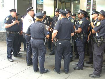
The New York City Police Department, modelled after London's Metropolitan Police, was established in 1844, and in 1853, they were officially given a navy blue uniform, the colour they wear today.[44]
Navy blue is one of the most popular school uniform colours, with the Toronto Catholic District School Board adopting a dress code policy which requires students system-wide to wear white tops and navy blue bottoms.[45]
Uniform of a lieutenant in the Royal Navy (1777). Marine blue became the official colour of the Royal Navy uniform coat in 1748.
George Washington chose blue and buff as the colours of the Continental Army uniform. They were the colours of the English Whig Party, which Washington admired.
The cadets of the Ecole Spéciale Militaire de Saint-Cyr, the French military academy, still wear the blue and red uniform of the French army before 1915.
School children in India. School uniforms are often blue.
New York City police officers on Times Square (2010)
Impressionist painting
The invention of new synthetic pigments in the 18th and 19th centuries considerably brightened and expanded the palette of painters. J. M. W. Turner experimented with the new cobalt blue, and of the twenty colors most used by the Impressionists, twelve were new and synthetic colours, including cobalt blue, ultramarine and cerulean blue.[46]
Another important influence on painting in the 19th century was the theory of complementary colors, developed by the French chemist Michel Eugene Chevreul in 1828 and published in 1839. He demonstrated that placing complementary colors, such as blue and yellow-orange or ultramarine and yellow, next to each other heightened the intensity of each color "to the apogee of their tonality."[47] In 1879 an American physicist, Ogden Rood, published a book charting the complementary colors of each color in the spectrum.[48] This principle of painting was used by Claude Monet in his Impression, Sunrise (1872), where he put a vivid blue next to a bright orange Sun, (1872) and in Régate à Argenteuil (1872), where he painted an orange Sun against blue water. The colors brighten each other. Renoir used the same contrast of cobalt blue water and an orange Sun in Canotage sur la Seine (1879–1880). Both Monet and Renoir liked to use pure colors, without any blending.[46]
Monet and the impressionists were among the first to observe that shadows were full of color. In his La Gare Saint-Lazare, the grey smoke, vapour and dark shadows are actually composed of mixtures of bright pigment, including cobalt blue, cerulean blue, synthetic ultramarine, emerald green, Guillet green, chrome yellow, vermilion and ecarlate red.[49] Blue was a favourite color of the impressionist painters, who used it not just to depict nature but to create moods, feelings and atmospheres. Cobalt blue, a pigment of cobalt oxide-aluminium oxide, was a favourite of Auguste Renoir and Vincent van Gogh. It was similar to smalt, a pigment used for centuries to make blue glass, but it was much improved by the French chemist Louis Jacques Thénard, who introduced it in 1802. It was very stable but extremely expensive. Van Gogh wrote to his brother Theo, "'Cobalt [blue] is a divine colour and there is nothing so beautiful for putting atmosphere around things..."[50]
Van Gogh described to his brother Theo how he composed a sky: "The dark blue sky is spotted with clouds of an even darker blue than the fundamental blue of intense cobalt, and others of a lighter blue, like the bluish white of the Milky Way... the sea was very dark ultramarine, the shore a sort of violet and of light red as I see it, and on the dunes, a few bushes of prussian blue."[51]
The Umbrellas, by Pierre Auguste-Renoir. (1881 and 1885). Renoir used cobalt blue for right side of the picture, but used the new synthetic ultramarine introduced in the 1870s, when he added two figures to left of the picture a few years later.
In Vincent van Gogh's Irises, the blue irises are placed against their complementary colour, yellow-orange.
Van Gogh's Starry Night Over the Rhône (1888). Blue used to create a mood or atmosphere. A cobalt blue sky, and cobalt or ultramarine water.
Wheatfield Under Thunderclouds (July 1890), one of the last paintings by Vincent van Gogh. He wrote of cobalt blue, "there is nothing so beautiful for putting atmosphere around things."
The blue suit
Blue had first become the high fashion color of the wealthy and powerful in Europe in the 13th century, when it was worn by Louis IX of France, better known as Saint Louis (1214–1270). Wearing blue implied dignity and wealth, and blue clothing was restricted to the nobility.[24] Black replaced blue as the power colour in the 14th century, when European princes, and then merchants and bankers, wanted to show their seriousness, dignity and devoutness (see Black).
Blue gradually returned to court fashion in the 17th century, as part of a palette of peacock-bright colours shown off in extremely elaborate costumes. The modern blue business suit has its roots in England in the middle of the 17th century. Following the London plague of 1665 and the London fire of 1666, King Charles II of England ordered that his courtiers wear simple coats, waistcoats and breeches, and the palette of colours became blue, grey, white and buff. Widely imitated, this style of men's fashion became almost a uniform of the London merchant class and the English country gentleman.[52]
During the American Revolution, the leader of the Whig Party in England, Charles James Fox, wore a blue coat and buff waistcoat and breeches, the colours of the Whig Party and of the uniform of George Washington, whose principles he supported. The men's suit followed the basic form of the military uniforms of the time, particularly the uniforms of the cavalry.[52]
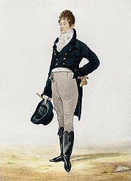
In the early 19th century, during the Regency of the future King George IV, the blue suit was revolutionized by a courtier named George Beau Brummel. Brummel created a suit that closely fitted the human form. The new style had a long tail coat cut to fit the body and long tight trousers to replace the knee-length breeches and stockings of the previous century. He used plain colors, such as blue and grey, to concentrate attention on the form of the body, not the clothes. Brummel observed, "If people turn to look at you in the street, you are not well dressed."[53] This fashion was adopted by the Prince Regent, then by London society and the upper classes. Originally the coat and trousers were different colors, but in the 19th century the suit of a single colour became fashionable. By the late 19th century the black suit had become the uniform of businessmen in England and America. In the 20th century, the black suit was largely replaced by the dark blue or grey suit.[52]
King Louis IX of France (on the right, with Pope Innocent) was the first European king to wear blue. It quickly became the colour of the nobles and wealthy.
Joseph Leeson, later 1st Earl of Milltown, in the typical dress of the English country gentleman in the 1730s.
Charles James Fox, a leader of the Whig Party in England, wore a blue suit in Parliament in support of George Washington and the American Revolution. Portrait by Joshua Reynolds (1782).
Beau Brummel introduced the ancestor of the modern blue suit, shaped to the body. (1805).
Man's suit, 1826. Dark blue suits were still rare; this one is blue-green or teal.
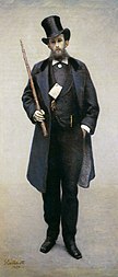
Man's blue suit in the 1870s, Paris. Painting by Caillebotte.
President John F. Kennedy popularized the blue two-button business suit, less formal than the suits of his predecessors. (1961)
In the 21st century, the dark blue business suit is among the most common style worn by world leaders
20th and 21st centuries
At the beginning of the 20th century, many artists recognized the emotional power of blue, and made it the central element of paintings. During his Blue Period (1901–1904) Pablo Picasso used blue and green, with hardly any warm colours, to create a melancholy mood. In Russia, the symbolist painter Pavel Kuznetsov and the Blue Rose art group (1906–1908) used blue to create a fantastic and exotic atmosphere. In Germany, Wassily Kandinsky and other Russian émigrés formed the art group called Der Blaue Reiter (The Blue Rider), and used blue to symbolize spirituality and eternity.[54]Henri Matisse used intense blues to express the emotions he wanted viewers to feel. Matisse wrote, "A certain blue penetrates your soul."[55]
In the art of the second half of the 20th century, painters of the abstract expressionist movement began to use blue and other colours in pure form, without any attempt to represent anything, to inspire ideas and emotions. Painter Mark Rothko observed that colour was "only an instrument;" his interest was "in expressing human emotions tragedy, ecstasy, doom, and so on."[56]
In fashion blue, particularly dark blue, was seen as a colour which was serious but not grim. In the mid-20th century, blue passed black as the most common colour of men's business suits, the costume usually worn by political and business leaders. Public opinion polls in the United States and Europe showed that blue was the favourite colour of over fifty per cent of respondents. Green was far behind with twenty per cent, while white and red received about eight per cent each.[57]
In 1873, a German immigrant in San Francisco, Levi Strauss, invented a sturdy kind of work trousers, made of denim fabric and coloured with indigo dye, called blue jeans. In 1935, they were raised to the level of high fashion by Vogue magazine. Beginning in the 1950s, they became an essential part of uniform of young people in the United States, Europe, and around the world.
Blue was also seen as a colour which was authoritative without being threatening. Following the Second World War, blue was adopted as the colour of important international organizations, including the United Nations, the Council of Europe, UNESCO, the European Union, and NATO. United Nations peacekeepers wear blue helmets to stress their peacekeeping role. Blue is used by the NATO Military Symbols for Land Based Systems to denote friendly forces, hence the term "blue on blue" for friendly fire, and Blue Force Tracking for location of friendly units. The People's Liberation Army of China (formerly known as the "Red Army") uses the term "Blue Army" to refer to hostile forces during exercises.[58]
The 20th century saw the invention of new ways of creating blue, such as chemiluminescence, making blue light through a chemical reaction.
The Blue Rider (1903), by Wassily Kandinsky, For Kandinsky, blue was the colour of spirituality: the darker the blue, the more it awakened human desire for the eternal.[54]
The Russian avant-garde painter Pavel Kuznetsov and his group, the Blue Rose, used blue to symbolize fantasy and exoticism. This is In the Steppe – Mirage (1911).
Blue jeans, made of denim coloured with indigo dye, patented by Levi Strauss in 1873, became an essential part of the wardrobe of young people beginning in the 1950s.
Blue neon lighting, first used in commercial advertising, is now used in works of art. This is Zwei Pferde für Münster (Two horses for Münster), a neon sculpture by Stephan Huber (2002), in Munster, Germany.
By the 13th century blue had become a popular colour; its use by nobility meant it became a rival of red.[59] The two colours were the most popular in the known and used spectrum of colours even as new colours and shades came around.[59] For the next five centuries the two colours competed with each other and in many areas contrasted each other.[59] In the 18th century blue started finding more use as red began to be used less in daily wear. In symbolism, in revolutions and movements, in schema and in chromatic classifications.[60] As blue became more popular, attaining blue pigment diversified and shades of blue competed with each other.[60] In 21st century surveys from a number of countries, blue is the most popular or favourite colour.[61][62][63][64]
The word blue was used in England the 17th century as a disparaging reference to rigid moral codes and those who observed them,[68] particularly in blue-stocking, a reference to Oliver Cromwell's supporters in the parliament of 1653.
In the middle of the 18th century, blue was the colour of Tory party, then the opposition party in England, Scotland and Ireland, which supported the British monarch and power of the landed aristocracy, while the ruling Whigs had orange as their colour. Flags of the two colours are seen over a polling station in the series of prints by William Hogarth called Humours of an election, made in 1754–55. Blue remains the colour of the Conservative Party of the UK today.
By the time of the American Revolution, The Tories were in power and blue and buff had become the colours of the opposition Whigs. They were the subject of a famous toast to Whig politicians by Mrs. Crewe in 1784; "Buff and blue and all of you." They also became the colours of the American patriots in the American Revolution, who had strong Whig sympathies, and of the uniforms of Continental Army led by George Washington.[69]
During the French Revolution and the revolt in the Vendée that followed, blue was the colour worn by the soldiers of the Revolutionary government, while the royalists wore white.
Blue Shirts, when used by itself, can refer to several organizations, mostly fascist organizations found in the 1920s and 1930
The Breton blues were members of a liberal, anti-clerical political movement in Brittany in the late 19th century.
The blueshirts were members of an extreme right paramilitary organization active in Ireland during the 1930s.
In the United States, television commentators use the term "blue states" for those states which traditionally vote for the Democratic Party in presidential elections, and "red states" for those which vote for the Republican Party.[70]
In the Canadian province of Quebec, the Blues are those who support sovereignty for Quebec, as opposed to the federalists. It is the colour of the Parti québécois and the Quebec Liberal Party.
In Brazil, blue states are the ones in which the Social Democratic Party has the majority, in opposition to the Workers' Party, usually represented by red.
A blue law was a type of law, typically found in the United States and Canada, designed to enforce religious standards, particularly the observance of Sunday as a day of worship or rest, and a restriction on Sunday shopping.
A painting by William Hogarth from 1854 shows a polling station with the blue flag of the Tory party and the orange flag of the Whigs.
The blue necktie of former British Prime Minister David Cameron represented his Conservative Party.
A map of the US showing the blue states, which voted for the Democratic candidate in all the last four Presidential elections, and the red states, which voted for the Republican.(last updated 2016)
Religion
Blue in Judaism: In the Torah,[72] the Israelites were commanded to put fringes, tzitzit, on the corners of their garments, and to weave within these fringes a "twisted thread of blue (tekhelet)".[73] In ancient days, this blue thread was made from a dye extracted from a Mediterranean snail called the hilazon. Maimonides claimed that this blue was the colour of "the clear noonday sky"; Rashi, the colour of the evening sky.[74] According to several rabbinic sages, blue is the colour of God's Glory.[75] Staring at this colour aids in mediation, bringing us a glimpse of the "pavement of sapphire, like the very sky for purity", which is a likeness of the Throne of God.[76] (The Hebrew word for glory.) Many items in the Mishkan, the portable sanctuary in the wilderness, such as the menorah, many of the vessels, and the Ark of the Covenant, were covered with blue cloth when transported from place to place.[77]
Blue in Christianity: Blue is associated with Christianity in general and Catholicism in particular, especially with the figure of the Virgin Mary.[78][79][80] It also represents the sin of lust.
Blue in Hinduism: Many of the gods are depicted as having blue-coloured skin, particularly those associated with Vishnu, who is said to be the preserver of the world and thus intimately connected to water. Krishna and Ram, Vishnu's avatars, are usually blue. Shiva, the destroyer, is also depicted in light blue tones and is called neela kantha, or blue-throated, for having swallowed poison in an attempt to turn the tide of a battle between the gods and demons in the gods' favour. Blue is used to symbolically represent the fifth, throat, chakra (Vishuddha).[81]
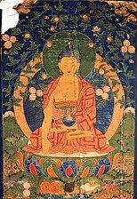
Blue in Buddhism: In South Asian tradition, several Buddhist figures may be depicted with blue skin, in reference to their dark complexion. In Sri Lanka, the Buddha's disciple Maudgalyāyana is depicted in this way. The nun Utpalavarṇā is similarly implied to have been of a comparatively dark complexion as her name means "colour of a blue water lily." The god Śakra is also sometimes depicted as blue, green, or black. In Tibetan Buddhism, the Buddha Bhaiṣajyaguru is usually painted blue in reference to his relationship to lapis lazuli. Another name for the goddess Ekajaṭī is "Blue Tara." Among the colours of the Buddhist flag, blue represents "the spirit of Universal Compassion." It is listed among the kasiṇa.[citation needed]
Blue in Paganism: Blue is associated with peace, truth, wisdom, protection, and patience. It helps with healing, psychic ability, harmony, and understanding.[84]
Vishnu, the supreme god of Hinduism, is often portrayed as being blue, or more precisely having skin the colour of rain-filled clouds.
In Catholicism, blue became the traditional colour of the robes of the Virgin Mary in the 13th century.
The Bhaisajyaguru, or "Medicine Master of Lapis Lazuli Light", is the Buddha of healing and medicine in Mahayana Buddhism. He traditionally holds a lapis lazuli jar of medicine.
In the Islamic World, blue and turquoise tile traditionally decorates the facades and exteriors of mosques and other religious buildings. This mosque is in Isfahan, Iran.
This lavatory sign on an All Nippon Airways Boeing 767-300 uses blue for the male gender
Blue is commonly used in the Western Hemisphere to symbolize boys, in contrast to pink used for girls. In the early 1900s, blue was the colour for girls, since it had traditionally been the colour of the Virgin Mary in Western Art, while pink was for boys (as it was akin to the colour red, considered a masculine colour).[85] Blue was first used as a gender signifier just prior to World War I (for either girls or boys), and first established as a male gender signifier in the 1940s. Sales was a particular motivation for the gendering of clothing, as well as the invention of prenatal sexing.[86]
Music
The blues is a popular musical form created in the United States in the 19th century by African-American musicians, based on African musical roots.[87] It usually expresses sadness and melancholy. A blue note is a musical note sung or played at a slightly lower pitch than the major scale for expressive purposes, giving it a slightly melancholy sound. It is frequently used in jazz and the blues.[88]Bluegrass is a subgenre of American country music, born in Kentucky and the mountains of Appalachia. It has its roots in the traditional folk music of the Scottish, and Irish.[89]
Blue can sometimes represent happiness and optimism in popular songs,[90] usually referring to blue skies.[91]
In many countries, blue is often used as a color for guide signs on highways.[92] In the Manual on Uniform Traffic Control Devices used in the United States, as well as in other countries with MUTCD-inspired signage, blue is often used to indicate motorist services. Many bus and rail systems around the world that colour code rail lines typically include a Blue Line. The colour blue has also been used extensively by several airlines.[93]
Associations and sayings
A man of the Tuareg people of North Africa wears a tagelmust or turban dyed with indigo. The indigo stains their skin blue; they were known by early visitors as "the blue men" of the desert.True blue is an expression in the United States which means faithful and loyal.[94]
Blue is often associated with excellence, distinction and high performance. The Queen of the United Kingdom and the Chancellor of Germany often wear a blue sash at formal occasions. In the United States, the blue ribbon is usually the highest award in expositions and county fairs. The Blue Riband was a trophy and flag given to the fastest transatlantic steamships in the 19th and 20th century. A blue-ribbon panel is a group of top-level experts selected to examine a subject.
A blue chip stock is a stock in a company with a reputation for quality and reliability in good times and bad. The term was invented in the New York Stock Exchange in 1923 or 1924, and comes from poker, where the highest value chips are blue.[96]
Someone with blue blood is a member of the nobility. The term comes from the Spanish sangre azul, and is said to refer to the pale skin and prominent blue veins of Spanish nobles.[97]
Blue is also associated with labour and the working class. It is the common colour of overalls blue jeans and other working costumes. In the United States "blue collar" workers refers to those who, in either skilled or unskilled jobs, work with their hands and do not wear business suits ("white collar" workers).
Blue is traditionally associated with the sea and the sky, with infinity and distance. The uniforms of sailors are usually dark blue, those of air forces lighter blue. The expression "The wild blue yonder" in the official song of the US Air Force refers to the sky.[98]
Blue is associated with cold water taps which are traditionally marked with blue.
Bluestocking was an unflattering expression in the 18th century for upper-class women who cared about culture and intellectual life and disregarded fashion. It originally referred to men and women who wore plain blue wool stockings instead of the black silk stockings worn in society.[97]
Blue is often associated with melancholy – having the "blues".
In English-speaking countries, the colour blue is sometimes associated with the risqué, for example "blue comedy", "blue movie" (a euphemism for a pornographic film) or "turning the air blue" (an idiom referring to profuse swearing).
In the English language, blue often represents the human emotion of sadness, for example, "He was feeling blue".
In German, to be "blue" (blau sein) is to be drunk. This derives from the ancient use of urine, particularly the urine of men who had been drinking alcohol in dyeing cloth blue with woad or indigo.[99] It may also be in relation to rain, which is usually regarded as a trigger of depressive emotions.[100]
In the German, Swedish and Norwegian languages, a naive person is said to look upon the world with a blue eye.[101][102]
In China, the colour blue is commonly associated with torment, ghosts, and death.[103] In a traditional Chinese opera, a character with a face powdered blue is a villain.[104]
In Turkey and Central Asia, blue is the colour of mourning.[103]
In the culture of the Hopi people of the American southwest, blue symbolized the west, which was seen as the house of death. A dream about a person carrying a blue feather was considered a very bad omen.[103]
In Thailand, blue is associated with Friday on the Thai solar calendar. Anyone may wear blue on Fridays and anyone born on a Friday may adopt blue as their colour.
The men of the Tuareg people in North Africa wear a blue turban called a tagelmust, which protects them from the sun and wind-blown sand of the Sahara desert. It is coloured with indigo. Instead of using dye, which uses precious water, the tagelmust is coloured by pounding it with powdered indigo. The blue colour transfers to the skin, where it is seen as a sign of nobility and affluence.[105] Early visitors called them the "Blue Men" of the Sahara.[106]
Sports
Many sporting teams make blue their official colour, or use it as detail on kit of a different colour. In addition, the colour is present on the logos of many sports associations. Along with red, blue is the most commonly used non-white colours for teams.
Antiquity
In the Late Roman Empire, during the time of Caligula, Nero and the emperors who followed, the Blues were a popular chariot racing team which competed in the Circus Maximus in Rome against the Greens, the Reds and Whites.[67] In the Byzantine Empire, The Blues and Greens were the two most popular chariot racing teams which competed in the Hippodrome of Constantinople. Each was connected with a powerful political faction, and disputes between the Green and Blue supporters often became violent. During the reign of the emperor Justinian I, after one competition in AD 532, riots between the two factions broke out, during which the cathedral and much of the centre of Constantinople were burned, and more than thirty thousand people were killed.[107]
Association football
In international association football, blue is a common colour on kits, as a majority of nations wear the colours of their national flag. A notable exception to this link is four-time FIFA World Cup winners Italy, who wear a blue kit based on the Azzuro Savoia (Savoy blue) of the royal House of Savoy which unified the Italian states, despite the Italian national flag being green, white and red.[108] The team themselves are known as Gli Azzurri (the Azures). Another World Cup winning nation with a blue shirt is France, who are known as Les Bleus (the Blues). Two neighbouring countries with two World Cup victories each, Argentina and Uruguay wear a light blue shirt, the former with white stripes. Uruguay are known as the La Celeste, Spanish for 'the sky blue one', while Argentina are known as Los Albicelestes, Spanish for 'the sky blue and whites'.[109]
Blue features on the logo of football's governing body FIFA, as well as featuring highly in the design of their website.[110] The European governing body of football, UEFA, uses two tones of blue to create a map of Europe in the centre of their logo. The Asian Football Confederation, Oceania Football Confederation and CONCACAF (the governing body of football in North and Central America and the Caribbean) use blue text on their logos.
In Major League Baseball, the premier baseball league in the United States and Canada, blue is one of the three colours, along with white and red, on the league's official logo. A team from Toronto, Ontario are nicknamed the Blue Jays. Sixteen other teams either regularly feature blue hats or use the colour in their uniforms.
The National Basketball Association, the premier basketball league in the United States and Canada, also has blue as one of the colours on their logo, along with red and white also, as did its female equivalent, the WNBA, until March 28, 2011, when the latter adopted an orange and white logo. Former NBA player Theodore Edwards was nicknamed "Blue". Fifteen NBA teams feature the colour in their uniforms.
The National Football League, the premier American football league in the United States, also uses blue as one of three colours, along with white and red, on their official logo. Thirteen NFL teams prominently feature the colour.
The National Hockey League, the premier Ice hockey league in Canada and the United States, uses blue on its official logo. Ten teams prominently feature the colour, with two teams (Columbus Blue Jackets and St. Louis Blues) featuring the colour in their nicknames. The team in St. Louis is primarily nicknamed after the eponymous music genre.
Blue is one of the three primary colours in the RYB colour model, as well as in the RGB (additive) colour model. It lies between violet and cyan on the spectrum of visible light. The term blue generally describes colors perceived by humans observing light with a dominant wavelength between approximately 450 and 495 nanometres. Most blues contain a slight mixture of other colours; azure contains some green, while ultramarine contains some violet. The clear daytime sky and the deep sea appear blue because of an optical effect known as Rayleigh scattering. An optical effect called the Tyndall effect explains blue eyes. Distant objects appear more blue because of another optical effect called aerial perspective.
Indigo is a term used for a number of hues in the region of blue. The word comes from the ancient dye of the same name. The term "indigo" can refer to the color of the dye, various colors of fabric dyed with indigo dye, a spectral color, one of the seven colors of the rainbow, or a region on the color wheel, and can include various shades of blue, ultramarine, and green-blue. Since the web era, the term has also been used for various purple and violet hues identified as "indigo", based on use of the term "indigo" in HTML web page specifications.
Red is the color at the long wavelength end of the visible spectrum of light, next to orange and opposite violet. It has a dominant wavelength of approximately 625–740 nanometres. It is a primary color in the RGB color model and a secondary color in the CMYK color model, and is the complementary color of cyan. Reds range from the brilliant yellow-tinged scarlet and vermillion to bluish-red crimson, and vary in shade from the pale red pink to the dark red burgundy.
Violet is the color of light at the short wavelength end of the visible spectrum. It is one of the seven colors that Isaac Newton labeled when dividing the spectrum of visible light in 1672. Violet light has a wavelength between approximately 380 and 435 nanometers. The color's name is derived from the Viola genus of flowers.
Purple is a color similar in appearance to violet light. In the RYB color model historically used in the arts, purple is a secondary color created by combining red and blue pigments. In the CMYK color model used in modern printing, purple is made by combining magenta pigment with either cyan pigment, black pigment, or both. In the RGB color model used in computer and television screens, purple is created by mixing red and blue light in order to create colors that appear similar to violet light.
Ultramarine is a deep blue color pigment which was originally made by grinding lapis lazuli into a powder. Its lengthy grinding and washing process makes the natural pigment quite valuable—roughly ten times more expensive than the stone it comes from and as expensive as gold.
Lazurite is a tectosilicate mineral with sulfate, sulfur and chloride with formula (Na,Ca)8[(S,Cl,SO4,OH)2|(Al6Si6O24)]. It is a feldspathoid and a member of the sodalite group. Lazurite crystallizes in the isometric system although well‐formed crystals are rare. It is usually massive and forms the bulk of the gemstone lapis lazuli.
Lapis lazuli, or lapis for short, is a deep-blue metamorphic rock used as a semi-precious stone that has been prized since antiquity for its intense color. Originating from the Persian word lazhuward meaning 'blue', lapis lazuli is a rock composed primarily of the minerals lazurite, pyrite and calcite. As early as the 7th millennium BC, lapis lazuli was mined in the Sar-i Sang mines, in Shortugai, and in other mines in Badakhshan province in modern northeast Afghanistan. Lapis lazuli artifacts, dated to 7570 BC, have been found at Bhirrana, which is the oldest site of Indus Valley civilisation. Lapis was highly valued by the Indus Valley Civilisation. Lapis beads have been found at Neolithic burials in Mehrgarh, the Caucasus, and as far away as Mauritania. It was used in the funeral mask of Tutankhamun.
A pigment is a powder used to add color or change visual appearance. Pigments are completely or nearly insoluble and chemically unreactive in water or another medium; in contrast, dyes are colored substances which are soluble or go into solution at some stage in their use. Dyes are often organic compounds whereas pigments are often inorganic. Pigments of prehistoric and historic value include ochre, charcoal, and lapis lazuli.
Orange is the colour between yellow and red on the spectrum of visible light. Human eyes perceive orange when observing light with a dominant wavelength between roughly 585 and 620 nanometres. In traditional colour theory, it is a secondary colour of pigments, produced by mixing yellow and red. In the RGB colour model, it is a tertiary colour. It is named after the fruit of the same name.
A lake pigment is a pigment made by precipitating a dye with an inert binder, or mordant, usually a metallic salt. Unlike vermilion, ultramarine, and other pigments made from ground minerals, lake pigments are organic. Manufacturers and suppliers to artists and industry frequently omit the lake designation in the name. Many lake pigments are fugitive because the dyes involved are not lightfast. Red lakes were particularly important in Renaissance and Baroque paintings; they were often used as translucent glazes to portray the colors of rich fabrics and draperies.
Grey or gray is an intermediate color between black and white. It is a neutral or achromatic color, meaning literally that it is "without color", because it can be composed of black and white. It is the color of a cloud-covered sky, of ash, and of lead.
Persian blue comes in three major tones: Persian blue proper: a bright medium blue; medium Persian blue ; and a kind of dark blue which is referred to as Persian indigo, dark Persian blue, or regimental, that is much closer to the web color indigo.
Cerulean, also spelled caerulean, is a shade of blue ranging between azure and a darker sky blue. The first recorded use of cerulean as a colour name in English was in 1590. The word is derived from the Latin word caeruleus, "dark blue, blue, or blue-green", which in turn probably derives from caerulum, diminutive of caelum, "heaven, sky".
Cobalt blue is a blue pigment made by sintering cobalt(II) oxide with aluminum(III) oxide (alumina) at 1200 °C. Chemically, cobalt blue pigment is cobalt(II) oxide-aluminium oxide, or cobalt(II) aluminate, CoAl2O4. Cobalt blue is lighter and less intense than the (iron-cyanide based) pigment Prussian blue. It is extremely stable and historically has been used as a coloring agent in ceramics (especially Chinese porcelain), jewelry, and paint. Transparent glasses are tinted with the silica-based cobalt pigment "smalt".
Marian blue is a tone of the color ultramarine named for its use with the Virgin Mary.
YInMn Blue, also known as Oregon Blue or Mas Blue, is an inorganic blue pigment that was discovered by Mas Subramanian and his (then) graduate student, Andrew Smith, at Oregon State University in 2009. The pigment is noteworthy for its vibrant, near-perfect blue color and unusually high NIR reflectance. The chemical compound has a unique crystal structure in which trivalent manganese ions in the trigonal bipyramidal coordination are responsible for the observed intense blue color. Since the initial discovery, the fundamental principles of colour science have been explored extensively by the Subramanian research team at Oregon State University, resulting in a wide range of rationally designed novel green, purple, and orange pigments, all through intentional addition of a chromophore in the trigonal bipyramidal coordination environment.
Lajvardina-type ceramics were developed in the 13th century following the Mongol invasion of Persia. It was produced throughout the Ilkhanate reign. It is characterized by its deep blue color and often features geometric patterns or foliage inlaid with gold leaf. The style was created using overglaze enamel. An initial layer of dark blue glaze, produced from cobalt, was applied, followed by another layer, often gold, on which the details were painted. It was primarily produced in Kashan, a center for ceramic production and lusterware in the 12th and early 13th centuries. The style was continuously used for tiles and ornamental objects from the 1260s C.E. until the mid-14th century, when production dropped significantly, coinciding with the fall of the Ilkhanate in 1335.
Blue pigments are natural or synthetic materials, usually made from minerals and insoluble with water, used to make the blue colors in painting and other arts. The raw material of the earliest blue pigment was lapis lazuli from mines in Afghanistan, that was refined into the pigment ultramarine. Since the late 18th and 19th century, blue pigments are largely synthetic, manufactured in laboratories and factories.
Green pigments are the materials used to create the green colors seen in painting and the other arts. Most come from minerals, particularly those containing compounds of copper. Green pigments reflect the green portions of the spectrum of visible light, and absorb the others. Important green pigments in art history include Malachite and Verdigris, found in tomb paintings in Ancient Egypt, and the Green earth pigments popular in the Middle Ages. More recent greens, such as Cobalt Green, are largely synthetic, made in laboratories and factories.
↑ Alessandro Bongioanni & Maria Croce (ed.), The Treasures of Ancient Egypt: From the Egyptian Museum in Cairo, Universe Publishing, a division of Ruzzoli Publications Inc., 2003. p. 310
↑ Chase, W.T. 1971, "Egyptian blue as a pigment and ceramic material." In: R. Brill (ed.) Science and Archaeology. Cambridge, Mass: MIT Press. ISBN0-262-02061-0
↑ J. Baines, "Color Terminology and Color Classification in Ancient Egyptian Color Terminology and Polychromy", in The American Anthropologist, volume 87, 1985, pp.282–97.
↑ Matson, F.R. (1985). Compositional Studies of the Glazed Brick from the Ishtar Gate at Babylon. Museum of Fine Arts. The Research Laboratory. ISBN978-0-87846-255-1.
↑ Jean Tulard, Jean-François Fayard, Alfred Fierro, Histoire et dictionnaire de la Révolution française, 1789–1799, Éditions Robert Laffont, collection Bouquins, Paris, 1987. ISBN2-7028-2076-X
↑ Metropolitan Police. "History". met.police.uk. Archived from the original on 3 December 2008.
↑ Okidegbe, Ngozi (2011), "I Love a Man in Uniform: The Debate Surrounding Uniforming the New York Police Force in the 19th Century", in Wiggerich, Sandro; Kensy, Steven (eds.), Staat Macht Uniform, Franz Steiner Verlag, ISBN978-3-515-09933-2
↑ Cheong Wa Dae / The Blue House, archived from the original on 27 September 2011, The Main Building and its two annexes are covered with a total of 150,000 traditional Korean blue roof tiles (hence, the name "Blue House" is also commonly used when referring to Cheongwadae).
↑ Kunzler's dictionary of Jazz provides two separate entries: blues, an originally African-American genre (p.128), and the blues form, a widespread musical form (p.131).
↑ Benward & Saker (2003). Music: In Theory and Practice, Vol. I, p.359. Seventh Edition. ISBN978-0-07-294262-0.
↑ Robert Cantwell, Bluegrass Breakdown: The Making of the Old Southern Sound (University of Illinois Press, 2002), pgs65–66.
Ball, Philip. Bright Earth: Art and Invention of Colour.
Heller, Eva (2004). Wie Farben wirken: Farbpsychologie, Farbsymbolik, kreative Farbgestaltung (in German). Berlin: Rowohlt.
——— (2009). Psychologie de la couleur: effets et symboliques (in French). Munich: Pyramyd. ISBN978-2-35017-156-2.
Pastoureau, Michel (2000). Bleu: Histoire d'une couleur (in French). Paris: Editions du Seuil. ISBN978-2-02-086991-1.
——— (2001). Blue: The History of a Color. Translated by Cruse, Markus I. Princeton, New Jersey: Princeton University Press.
Riley, Charles A. II (1995). Color Codes: Modern Theories of Color in Philosophy, Painting and Architecture, Literature, Music, and Psychology. Hanover, New Hampshire: University Press of New England.
Varichon, Anne (2005). Couleurs: pigments et teintures dans les mains des peuples (in French). Paris: Editions du Seuil. ISBN978-2-02-084697-4.
Further reading
Broecke, Lara (2015). Cennino Cennini's Il Libro dell'Arte: a New English Translation and Commentary with Italian Transcription. Archetype. ISBN978-1-909492-28-8.
Mollo, John (1991). Uniforms of The American Revolution in Color. Illustrated by Malcolm McGregor. New York: Stirling Publications. ISBN978-0-8069-8240-3.
Pastoureau, Michel (2010). Les couleurs de nos souvenirs (in French). Paris: Editions du Seuil. ISBN978-2-02-096687-0.
This page is based on this Wikipedia article Text is available under the CC BY-SA 4.0 license; additional terms may apply. Images, videos and audio are available under their respective licenses.


