Related Research Articles

Fashion is a form of self-expression and autonomy at a particular period and place and in a specific context, of clothing, footwear, lifestyle, accessories, makeup, hairstyle, and body posture. In its everyday use, the term implies a look defined by the fashion industry as that which is trending. Everything that is considered fashion is available and popular by the fashion system.
Pantone LLC is a limited liability company headquartered in Carlstadt, New Jersey. The company is best known for its Pantone Matching System (PMS), a proprietary color space used in a variety of industries, notably graphic design, fashion design, product design, printing and manufacturing and supporting the management of color from design to production, in physical and digital formats, among coated and uncoated materials, cotton, polyester, nylon and plastics.

The flag of Norway is red with an indigo blue Scandinavian cross fimbriated in white that extends to the edges of the flag; the vertical part of the cross is shifted to the hoist side in the style of the Dannebrog, the flag of Denmark.

The flag of Switzerland displays a white cross in the centre of a square red field. The white cross is known as the Swiss cross. Its arms are equilateral, and their ratio of length to width is 7:6. The size of the cross in relation to the field was set in 2017 as 5:8.
Cerulean, also spelled caerulean, is a shade of blue ranging between azure and a darker sky blue.
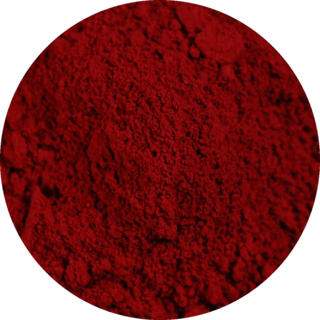
Carmine color, also known as Imperial, is the general term for some deep red colours that are very slightly purplish but are generally slightly closer to red than the colour crimson is. Some rubies are coloured the colour shown below as rich carmine. The deep dark red color shown at right as carmine is the colour of the raw unprocessed pigment, but lighter, richer, or brighter colours are produced when the raw pigment is processed, some of which are shown below.
The Color Association of the United States (CAUS), known until 1955 as the Textile Color Card Association of the United States (TCCA), is an independent color trend forecasting and color consulting service to the business community, known for its textile color swatch book, the Standard Color Reference of America.
Colour Index International is a reference database jointly maintained by the Society of Dyers and Colourists and the American Association of Textile Chemists and Colorists. It currently contains over 27,000 individual products listed under 13,000 Colour Index Generic Names. It was first printed in 1925 but is now published solely on the World Wide Web. The index serves as a common reference database of manufactured colour products and is used by manufacturers and consumers, such as artists and decorators.
AATCC—the American Association of Textile Chemists and Colorists—is a 501(c)(6) not-for-profit professional association that provides test method development, quality control materials, educational development, and networking for textile and apparel professionals throughout the world.
In optics, orange has a wavelength between approximately 585 and 620 nm and a hue of 30° in HSV color space. In the RGB color space it is a secondary color numerically halfway between gamma-compressed red and yellow, as can be seen in the RGB color wheel. The complementary color of orange is azure. Orange pigments are largely in the ochre or cadmium families, and absorb mostly blue light.

Air Force blue colours are a variety of colours that are mostly various tones of the colour azure, the purest tones of which are identified as being the colour of the sky on a clear day.
The Color Marketing Group (CMG) is an international association for color design professionals which identifies the direction of color and design trends and translates them into salable colors for manufactured products.
The British Colour Council (BCC) was an industry standards organisation, active from the 1930s to the 1950s, which produced indexes of named colours for use by government, industry, academia, and horticulture.
Lidewij Edelkoort, often called Li, is a Dutch trend forecaster, someone who anticipates future fashion and design trends.
Pink colors are usually light or desaturated shades of reds, roses, and magentas which are created on computer and television screens using the RGB color model and in printing with the CMYK color model. As such, it is an arbitrary classification of color. Below is a list of some of the common pink colors.
Fashion merchandising can be defined as the planning and promotion of sales by presenting a product to the right market at the proper time, by carrying out organized, skillful advertising, using attractive displays, etc. Merchandising, within fashion retail, refers specifically to the stock planning, management, and control process. Fashion Merchandising is a job that is done world- wide. This position requires well-developed quantitative skills, and natural ability to discover trends, meaning relationships and interrelationships among standard sales and stock figures. In the fashion industry, there are two different merchandising teams: the visual merchandising team, and the fashion merchandising team.
Fashion forecasting is a global career that focuses on upcoming trends. A fashion forecaster predicts the colors, fabrics, textures, materials, prints, graphics, beauty/grooming, accessories, footwear, street style, and other styles that will be presented on the runway and in the stores for the upcoming seasons. The concept applies to not one, but all levels of the fashion industry including haute couture, ready-to-wear, mass market, and street wear. Fashion trend forecasting is an overall process that focuses on other industries such as automobiles, medicine, food and beverages, literature, and home furnishings. Fashion forecasters are responsible for attracting consumers and helping retail businesses and designers sell their brands. Today, fashion industry workers rely on the Internet to retrieve information on new looks, colors, celebrity wardrobes, and designer collections.
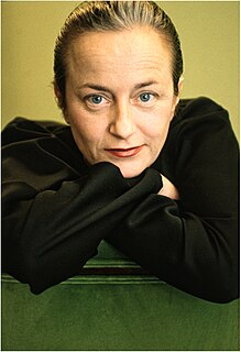
Pepa Poch is an artist, creator and painter known for her personal use of colour. She is a former member of the International Colour Authority, and the colors of her oil paintings are global color trend.
Fashion trend forecasting is the process of predicting fashion trends for upcoming seasons in order for brands to better plan future collections based on consumer behavior, market changes, social and political movements, and more. The fashion industry is a constantly changing landscape, and today’s technological advancements allow fashion trend forecasters to create more precise predictions than in the past. These new options provide a more complete framework for forecasting future fashion trends, and there exist different approaches to this practice.
Clothing color is an essential aspect of the aesthetic properties of clothing. The color of clothing has a significant impact on one's appearance. Our clothes communicate about us and reveal our social and economic standing. When color combines with the style, garment fitting, fashion compatibility, fabric construction, and clothing material finish all contribute to the visual perception that suffices aesthetic comfort.
References
- ↑ "Interview to Pepa Poch, Painter: "Colour is a feeling"". Barcelona és moda. Cambra de Comerç de Barcelona. Retrieved 24 October 2016.
- ↑ "Don't Be Off-colour [ permanent dead link ]". International Trade Forum, 1 (2001)
Color topics | ||||||||
|---|---|---|---|---|---|---|---|---|
| Color science |
|  | ||||||
| Color philosophy |
| |||||||
| Color terms |
| |||||||
| Color organizations | ||||||||
| Lists | ||||||||
| Related | ||||||||
This fashion-related article is a stub. You can help Wikipedia by expanding it. |