Color or colour is the visual perception based on the electromagnetic spectrum. Though color is not an inherent property of matter, color perception is related to an object's light absorption, reflection, emission spectra and interference. For most humans, colors are perceived in the visible light spectrum with three types of cone cells (trichromacy). Other animals may have a different number of cone cell types or have eyes sensitive to different wavelength, such as bees that can distinguish ultraviolet, and thus have a different color sensitivity range. Animal perception of color originates from different light wavelength or spectral sensitivity in cone cell types, which is then processed by the brain.
Cyan is the color between blue and green on the visible spectrum of light. It is evoked by light with a predominant wavelength between 490 and 520 nm, between the wavelengths of green and blue.

Indigo is a term used for a number of hues in the region of blue. The word comes from the ancient dye of the same name. The term "indigo" can refer to the color of the dye, various colors of fabric dyed with indigo dye, a spectral color, one of the seven colors of the rainbow, or a region on the color wheel, and can include various shades of blue, ultramarine, and green-blue. Since the web era, the term has also been used for various purple and violet hues identified as "indigo", based on use of the term "indigo" in HTML web page specifications.
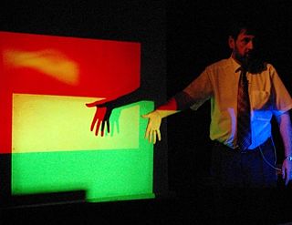
The RGB color model is an additive color model in which the red, green and blue primary colors of light are added together in various ways to reproduce a broad array of colors. The name of the model comes from the initials of the three additive primary colors, red, green, and blue.

A set of primary colors or primary colours consists of colorants or colored lights that can be mixed in varying amounts to produce a gamut of colors. This is the essential method used to create the perception of a broad range of colors in, e.g., electronic displays, color printing, and paintings. Perceptions associated with a given combination of primary colors can be predicted by an appropriate mixing model that reflects the physics of how light interacts with physical media, and ultimately the retina.

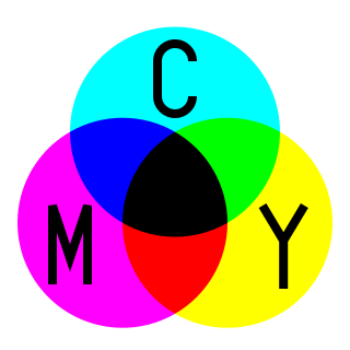
Magenta is a purplish-red color. On color wheels of the RGB (additive) and CMY (subtractive) color models, it is located precisely midway between red and blue. It is one of the four colors of ink used in color printing by an inkjet printer, along with yellow, cyan, and black to make all the other colors. The tone of magenta used in printing, printer's magenta, is redder than the magenta of the RGB (additive) model, the former being closer to rose.

In color theory, hue is one of the main properties of a color, defined technically in the CIECAM02 model as "the degree to which a stimulus can be described as similar to or different from stimuli that are described as red, orange, yellow, green, blue, violet," within certain theories of color vision.
The color of chemicals is a physical property of chemicals that in most cases comes from the excitation of electrons due to an absorption of energy performed by the chemical. What is seen by the eye is not the color absorbed, but the complementary color from the removal of the absorbed wavelengths. This spectral perspective was first noted in atomic spectroscopy.

Complementary colors are pairs of colors which, when combined or mixed, cancel each other out by producing a grayscale color like white or black. When placed next to each other, they create the strongest contrast for those two colors. Complementary colors may also be called "opposite colors".
Color theory, or more specifically traditional color theory, is the historical body of knowledge describing the behavior of colors, namely in color mixing, color contrast effects, color harmony, color schemes and color symbolism. Modern color theory is generally referred to as Color science. While there is no clear distinction in scope, traditional color theory tends to be more subjective and have artistic applications, while color science tends to be more objective and have functional applications, such as in chemistry, astronomy or color reproduction. Color theory dates back at least as far as Aristotle's treatise On Colors. A formalization of "color theory" began in the 18th century, initially within a partisan controversy over Isaac Newton's theory of color and the nature of primary colors. By the end of the 19th century, a schism had formed between traditional color theory and color science.

This is an index of color topic-related articles.
Subtractive color or subtractive color mixing predicts the spectral power distribution of light after it passes through successive layers of partially absorbing media. This idealized model is the essential principle of how dyes and pigments are used in color printing and photography, where the perception of color is elicited after white light passes through microscopic "stacks" of partially absorbing media allowing some wavelengths of light to reach the eye and not others, and also in painting, whether the colors are mixed or applied in successive layers.

A secondary color is a color made by mixing two primary colors of a given color model in even proportions. Combining two secondary colors in the same manner produces a tertiary color. Secondary colors are special in traditional color theory, but have no special meaning in color science.

A spectral color is a color that is evoked by monochromatic light, i.e. either a spectral line with a single wavelength or frequency of light in the visible spectrum, or a relatively narrow spectral band. Every wave of visible light is perceived as a spectral color; when viewed as a continuous spectrum, these colors are seen as the familiar rainbow. Non-spectral colors are evoked by a combination of spectral colors.
A color model is an abstract mathematical model describing the way colors can be represented as tuples of numbers, typically as three or four values or color components. When this model is associated with a precise description of how the components are to be interpreted, taking account of visual perception, the resulting set of colors is called "color space."
There are three types of color mixing models, depending on the relative brightness of the resultant mixture: additive, subtractive, and average. In these models, mixing black and white will yield white, black and gray, respectively. Physical mixing processes, e.g. mixing light beams or oil paints, will follow one or a hybrid of these 3 models. Each mixing model is associated with several color models, depending on the approximate primary colors used. The most common color models are optimized to human trichromatic color vision, therefore comprising three primary colors.
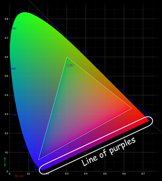
In color theory, the line of purples or purple boundary is the locus on the edge of the chromaticity diagram formed between extreme spectral red and violet. Except for these endpoints of the line, colors on the line are non-spectral. Rather, every color on the line is a unique mixture in a ratio of fully saturated red and fully saturated violet, the two spectral color endpoints of visibility on the spectrum of pure hues. Colors on the line and spectral colors are the only ones that are fully saturated in the sense that, for any point on the line, no other possible color being a mixture of red and violet is more saturated than it.

Varieties of the color blue may differ in hue, chroma, or lightness, or in two or three of these qualities. Variations in value are also called tints and shades, a tint being a blue or other hue mixed with white, a shade being mixed with black. A large selection of these colors are shown below.
This article provides introductory information about the RGB, HSV, and HSL color models from a computer graphics perspective. An introduction to colors is also provided to support the main discussion.


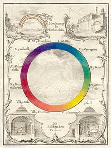

 Newton's asymmetric color wheel based on musical intervals. Mixing "rays" in amounts given by the circles yields color "z" (1704)
 Goethe's symmetric color wheel with 'reciprocally evoked colors' (1810)
 A color circle based on additive combinations of the light spectrum, after Schiffman (1990)
 Human Color Wheel based on the hue and light detected on human skins, after Harbisson (2004–2009)
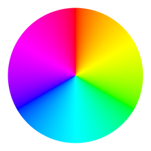
 RGB color wheel
 RYB color wheel
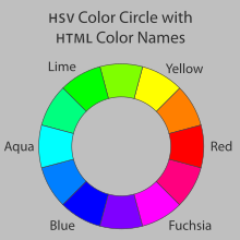
 Color circle based on the HSV color space, showing all colors with a value (brightness) of 255 (100%). White is at the center, and fully saturated colors are at the outer edge. It is the circular face of the HSV "color cone".